Diving Deeper into Opioid Prescriber Data

Last week we introduced the new CMS opioid data set and what it means. This data tries to initiate transparency around this hot topical area even though Part D Medicare claims may not be the best proxy of all opioid prescription activity. There are three elements to this data:

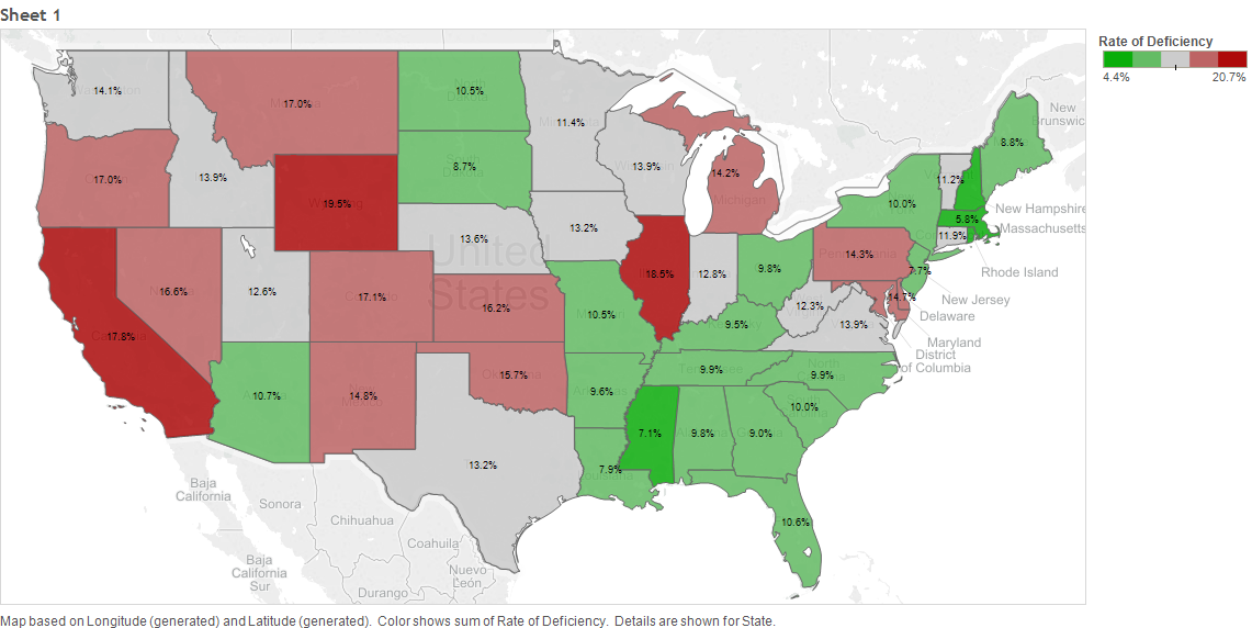
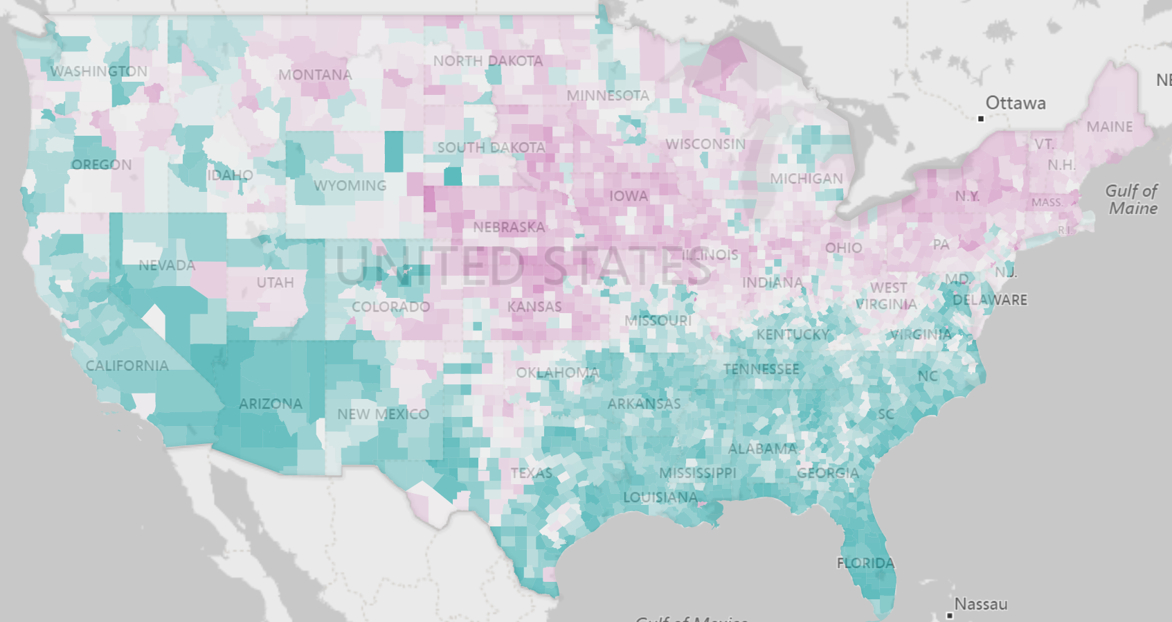
  • Part D opiod claims are compared to all Part D claims on a county and zip code basis to come up with a prescribing rate. The national average for this rate is 5.7%. There is some high variation with rural counties with many counties carrying rates above 10%.


  • Extended release opioid claims are compared to all opoid claims to come up with an extended release rate. Extended release medications have shown to have some effect at reducing both intentional and accidental overdose. The extended release to opioid national rate was 6.4%. There is also lower rate variation to this data and the rates are more evenly split between urban and rural counties.

  • Medicare opioid providers are compared to the total number of Medicare providers to come up with a provider ratio. The national average is 46.9%.

The Opioid Prescribing Rate Interactive gives a rapid analysis of this data down to individual counties and zip codes. It is automatically available to subscribers as part of our growing Community Health library.  We also provided a free Interactive for you to do some preliminary analysis on a state by state basis. The full Interactive provides zip code level analysis and the extended release and provider analysis.  


Share This Story

Similar Posts

  • Student Debt Continues to Rise – Repayments Flat

    Last week, the Government Accountability Offices announced that the federal government will forgive a whopping $108 billion in student loans in the coming years. Prognosticators project a coming economic doom as the student debt crisis approaches mortgage meltdown proportions.   Last week we focused on the earnings of students six…

  • Death Rate Continues to Inch Up

    The mortality (or death) rate increased nominally from 2016 to 2017 going from 844 to 849 deaths per 100,000. This probably is not earthshaking news but based on the overall crude rate, it has actually been increasing since 2009 as noted by the following graph.   Advances in medical care…

  • When is Free Tuition Really Free?

    The sticker pricing game has been in place a long time. No one ever pays full sticker price for items such as jewelry or cars. That is probably why University of Michigan came under scrutiny for its free tuition guarantee for families with income under $65,000. Cynics pointed this out…

  • Are Outpatient Imaging Quality Measures Effective?

    CMS began developing measures evaluating imaging efficiency back in 2007. These performance measures have been distributed as part of Hospital Compare for the past four years. Lower percentages suggest more efficient use of medical imaging. The purpose of reporting these measures is to reduce unnecessary exposure to contrast materials and/or…

  • Students Increasingly Opting for High Cost Debt

    Many prognosticators are projecting a coming economic crisis caused by student debt. This is typically focused around an inability to pay off the principal of the loan. But it really appears that we are also setting ourselves up for a real problem with the cost of debt.    Overall new…

  • March 2020 Job Postings Signals Seismic Labor Shifts

    New Labor Market Analysis Application Released by Public Insight The COVID-19 reality is starting to reflect itself in the labor market. Volatility in the labor market will be the new normal for the foreseeable future. We analyzed and coded over 2 million active job postings as of past Saturday, March…