Regional Variations in Opioid Prescribing Rates

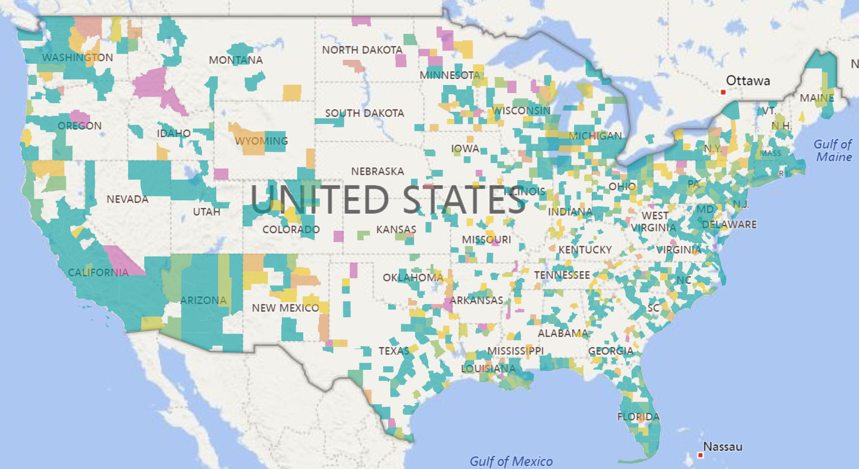
Given the state of the opioid crisis, any meaningful data is valuable. So when CMS released three years of Opioid Part D prescription data in November, we all rejoiced. CMS also released a mapping tool to analyze the data. While mapping tools can be effective, they can also get in the way.


We recently got under the hood of this data and released a new Opioid Prescribing Rates Interactive. It is automatically available to subscribers as part of our growing Community Health library. An analysis of the data becomes more meaningful when we can actually sort and manipulate the data and relate it to other data such as population.


In the video blog, we discuss the following:

  1. Why mapping is not always the best tool for this type of analysis.

  2. Why good old tables present a quick way of analyzing this type of data.

  3. Which counties and states experienced the highest prescribing rates.


Share This Story

Similar Posts

  • Villanova vs. Michigan in Athletic Costs

    Villanova clearly dominated Michigan on the basketball court and has now won the NCAA Men’s basketball tournament two of the last three years. But how has that success translated to other sports and to the athletic costs in general.    The Equity in Athletics data is released annually by the…

  • The Debt Service Cost of PLUS Loans

    Last week, we observed that the PLUS loan program continues to escalate both in terms of dollars borrowed and in terms of recipients. Using the newly published Financial Aid Interactive, we projected the number of dollars borrowed by PLUS loan borrowers will increase 1.25 billion for the year ending June,…

  • Student Financial Aid up 6.2%

    Postsecondary institutions gave over $17 billion in financial aid in 2015. This represented a 3% increase from 2014. However, the number of student receiving the financial aid declined 3% so the average financial aid per student when looked at over the entire postsecondary landscape actually increased 6%. We used data…

  • Death Rate Continues to Inch Up

    The mortality (or death) rate increased nominally from 2016 to 2017 going from 844 to 849 deaths per 100,000. This probably is not earthshaking news but based on the overall crude rate, it has actually been increasing since 2009 as noted by the following graph.   Advances in medical care…

  • Healthcare Rankings and the Healthiest Cities

    We in the U.S. love our rankings. I think it is embedded in our DNA. As a student of data, I love to see the various rankings and how people get worked up over them. Healthgrades recently released its latest analysis of top quality hospitals and its National Health Index, which…

  • College Building Boom Approaches $1 Trillion

    Postsecondary institutions continue to invest heavily in capital assets and the cumulative investment across public and private institutions has crossed $900 billion, an increase of 27% over a five-year period. The capital investment growth rates are almost identical for both public institutions and private non-profit institutions as noted in the…