Infection Rates and the Long-Term View

My Cleveland Indians have now won 13 games in a row. That along with their overall record and stellar play over the entire season tells me they are a good team. However, at any given point the Indians or any particular player could play really poorly. The similar challenge with ratings is they can give us a false snapshot at any particular point in time. For example, if we measure infection rates at just a particular period of time, we are prone to come to the wrong conclusions. As an example, this article by Consumer Reports names 19 teaching hospitals with higher than the national average infection rates. It is based on a snapshot at one particular time.


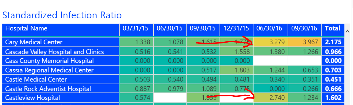
The Hospital Compare data tends to give us all a short-term view. In just the most recent data from September 2016, nearly 15% of hospitals had an increase or a decrease of 30% or more in the infection rate of clostridium difficile (aka C. diff). These variations really pop when looking at the data over many quarters with the Quality Ratings Interactive. For example, it is apparent that Cary Medical Center has a two quarter infection issue whereas Castleview had a high rate just in the June quarter.


While we love winners and losers, what really matters is a long-term sustained view of how facilities perform over time.


Share This Story

Similar Posts

  • Hot Jobs, Growing Wages, and Weird Titles

    I love looking at the Bureau of Labor Statistics Occupational Employment Statistics data. This data produces employment and wage estimates annually for over 800 occupations and estimates for states and metropolitan areas. I especially enjoy looking at this data from both a job growth and a wage growth perspective. That…

  • Has Distance Education Hit Its Peak?

    Programs offered through distance education or what we might conventionally refer to as online programs actually declined as a percentage of all programs from 10.8% to 10.5% in 2017 and 2016 respectively. This was the first time that distance education has actually declined since this data started being collected by…

  • Using AI to Break Down Head Count

    New Microsoft® Power BI Visual Dynamically Analyzes Categorical Data Like fashion goes in and out of style, so do visual ways of exploring data. Several decades ago I worked with a visual called the Decomposition Tree from an upstart company Proclarity from Boise, Idaho to analyze multi-dimensional data. That company…

  • Villanova vs. Michigan in Athletic Costs

    Villanova clearly dominated Michigan on the basketball court and has now won the NCAA Men’s basketball tournament two of the last three years. But how has that success translated to other sports and to the athletic costs in general.    The Equity in Athletics data is released annually by the…

  • STEM Enrollment Fields Show Strong Growth

    The IPEDS Enrollment by Major Fields of Study is collected every other year and 2016 is a new reported year. IPEDS collects nine major fields of study and the enrollment is disaggregated by attendance status (full-time, part-time), level (undergraduate, graduate), race, and gender.   There are numerous ways to breakdown…

  • More Students Paying Out-of-State Tuition Rates

    Over 230,000 students pay out-of-state tuition rates compared to approximately 1.5 million students who pay in-state or in-district rates according to the most recent cohort group from IPEDS. This represents 13.09% of the students and continues an upward progression of out-of-state paying students.    The number of students paying out-of-state…