Student Debt Rises 13%

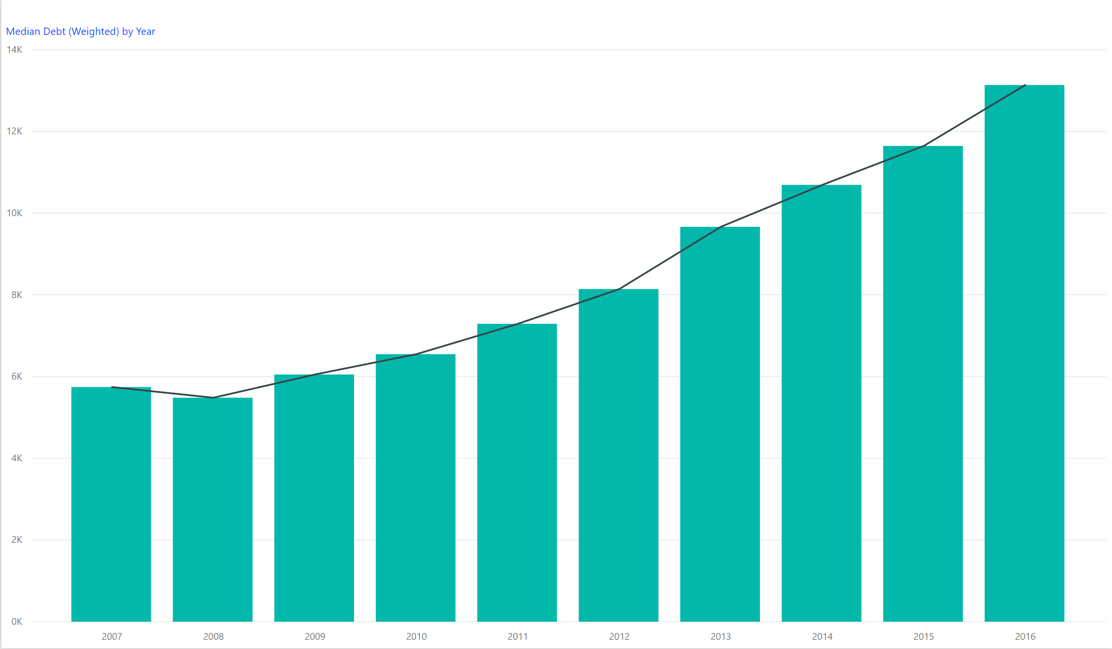
The newest College Scorecard data released several weeks ago reveals an ongoing trend in student debt. The median student debt increased 13.1% from 2015 to 2016. The median student debt has now more than doubled since 2007 as shown by the following graph. We calculated this using a weighted average of the number of students in the cohort times the median debt by institution. There are over 37 million students in 2016 reflected in this calculation.  You can browse the new College Scorecard data for free using our Data Browser tool.


Median Debt is defined within the College Scorecard documentation as the debt accumulated at the institution by all student borrowers of federal loans who separate (i.e., either graduate or withdraw) in a given fiscal year, measured at the point of separation. More specifically, the measure represents the sum of all undergraduate federal loans over students’ college education at the institution for which the median debt is reported for —e.g., if a student receives a federal loan for $2,000 for each of eight semesters at one institution, their cumulative debt is recorded as $16,000 for that institution. Median Debt does not represent all forms of debt, but only subsidized forms of loans. 


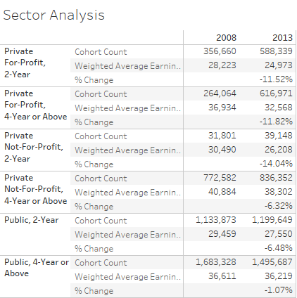
The student debt data is disaggregated by a number of criteria such as gender, completion status, pell recipients, or family income.  

Share This Story

Similar Posts

  • What is the Newly Released Carnegie Data?

    The Carnegie Classification™ has been the major institutional framework for describing higher education institutions since 1970. This classification system comes out approximately every five years with the latest rendition released on February 1, 2016. This release represents the initial data provided by the Indiana University Bloomington Center for Postsecondary Research…

  • Diving Deeper into Opioid Prescriber Data

    Last week we introduced the new CMS opioid data set and what it means. This data tries to initiate transparency around this hot topical area even though Part D Medicare claims may not be the best proxy of all opioid prescription activity. There are three elements to this data: Part…

  • Spring is Here! Which Counties are Physically Active

    I love spring!  As a warm weather person living in the Northeast, I can’t wait to get outside and be physically active. While many are like me, still 29% of the U.S. remains by and large physically inactive and it is very regionally concentrated. The County Health Rankings uses a measure…

  • International Student Enrollment Visualized

    In last week’s blog, we talked about out of state enrollment and its potential impact on both the diversity and finances of the university. International enrollment is even considered a bigger potential bonanza to colleges and universities as many international students pay full tuition. According to the Institute of International…

  • Death Rate Continues to Inch Up

    The mortality (or death) rate increased nominally from 2016 to 2017 going from 844 to 849 deaths per 100,000. This probably is not earthshaking news but based on the overall crude rate, it has actually been increasing since 2009 as noted by the following graph.   Advances in medical care…

  • Death Rates Rise Sharply for Millenials

    The new CDC mortality data continues to paint a rather grim picture. Last week we focused on the external causes of the rise in death rates. This week we analyzed the mortality (death) rate among age groups using over 1.8 billion data points over 17 years from the CDC. You…