The Gender Debt Disparity

The Huffington Post recently posted a very interesting article on gender debt disparity. The article notes that women hold nearly two-thirds of all student debt – a whopping $833 billion dollars. The article postulates that women also take longer to pay off the debt because they earn less than men.


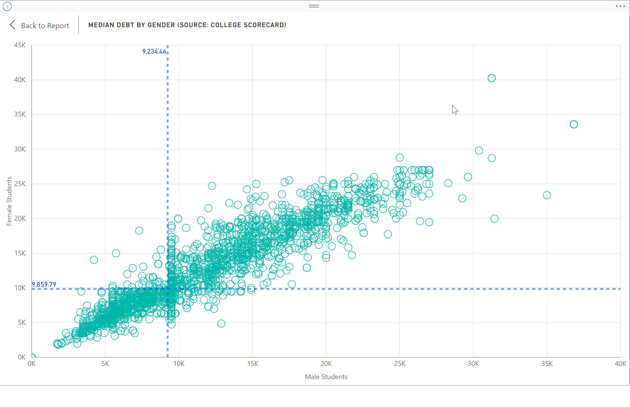
I wanted to see how that coincides with the student debt levels as reported by the U.S. Department of Education via the College Scorecard database. This database tracks the cumulative median loan debt and then disaggregates the debt by various factors including gender for approximately 6,000 institutions. The disaggregated data is profiled in the Public Insight Student Debt Interactive. You can also browse it for free using our Data Browser tool. The data, using a simple average across institutions, shows that women have a median debt level 6.7% higher than men ($9,859 vs $9,234). A scatterplot of the student loan mix is shown below. There are limitations to the data as this database only reports federal loan activity and not other loan sources such as Parent Plus loans.


The Huffington article makes the assumption that because women earn less, they take longer to pay off the student debt. But does it make them less reliable to pay down the debt? The College Scorecard database reports debt repayment rates again disaggregated by gender. The definition is very important. It is those that have entered repayment status and have made some progress in paying down their student loans which is something greater than $1 of principal.  We used the three-year metric after entering repayment status.

While women may have more debt, they are nearly 3% (48% to 45%) more likely than men on average across all institutions to have made a dent in their loan. Again, we can see the distribution using the scatterplot below. I have to be honest and say this does not surprise me in the least. I spent five years going around the world in the infancy of the microfinance movement and women are notoriously better borrowers than men. Over 90% of micro loans worldwide are to women.


Share This Story

Similar Posts

  • The States That Send Students Elsewhere

    IPEDS reports residency numbers for first-time undergraduates by state. This data can be challenging to work with from several perspectives. It is not collected every year by every institution and it does not summarize the students coming from out of the state of the institution.     The Enrollment Suite…

  • Tuition Bears Increasing Brunt of Higher Ed. Revenue

    In 2011, Tuition and Fees represented 20.6% of public institutional revenue. In 2015, it has increased to 24.25%. Most of the reshuffling of revenue has come from federal operating grants and contracts as noted by the graphs below. Interestingly, state appropriations have remained relatively constant. Similarly, non-profit institutions have seen tuition…

  • Diving Deeper into Opioid Prescriber Data

    Last week we introduced the new CMS opioid data set and what it means. This data tries to initiate transparency around this hot topical area even though Part D Medicare claims may not be the best proxy of all opioid prescription activity. There are three elements to this data: Part…

  • What the Ascension – Presence Merger Reveals

    This week, Ascension Health acquired Presence Health, combining the largest Catholic-sponsored healthcare system in Illinois with the nation’s largest Catholic health system, the companies announced Tuesday. The acquisition is subject to regulatory approvals. The deal underscores a continued trend towards market consolidation.    It seems Ascension, at 141 hospitals, acquiring an…

  • Income Inequality Marches On

    Welcome to 2018!  We are making some fundamental shifts to our Weekly Insights which I hope you will enjoy.  We are moving our content towards more video and free self-service analysis around our weekly topical theme. We welcome your feedback and your ideas.    Over 70% of population health is…

  • Death Rates Rise Sharply for Millenials

    The new CDC mortality data continues to paint a rather grim picture. Last week we focused on the external causes of the rise in death rates. This week we analyzed the mortality (death) rate among age groups using over 1.8 billion data points over 17 years from the CDC. You…