Employment Numbers Support America's Love of Eating Out

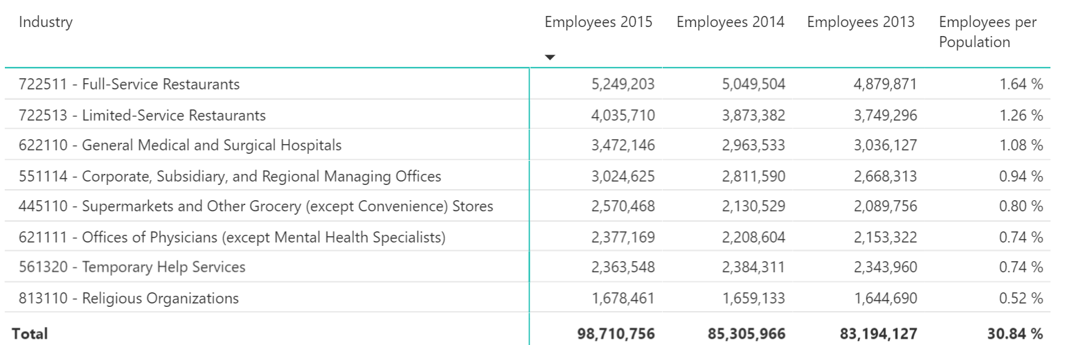
One of my favorite movie lines is from the movie “A Christmas Story”. After the Bumpus dogs demolish the Thanksgiving turkey, Ralphie’s dad says, while holding a half-eaten drumstick, “we are going out to eat”. We Americans love to eat our food out, as evidenced by the fact that 1 in 30 Americans are employed in the restaurant industry, according to the most recent data from the U.S. Census. Moreover employment in the restaurant industry continues to tick up as shown by the following table.


The Census Bureau recently released new 2015 County Business Patterns data which includes data on employees per industry based on the North American Industry Classification System (NAICS). County Business Patterns is based on the number of employees for the payroll period including March 12 of the applicable year so it does not really factor in seasonal workers. The largest employers on a per-capita basis are in the restaurant industry with 3.14% employed in NAICS code 7225 which are restaurant groupings. This is based on U.S. population of about 320 million. Using employable Americans (those 18 and over or 240 million), the number is over 4%. 


Breaking this down further, full-service restaurants employ more people on a per-capita basis than limited-service, or fast food restaurants. Also included in our top five is another food-related industry, grocery stores (NAICS 445110), which employed nearly 2.6 million workers in 2015. We Americans love our food and we employ lots of people in the food distribution system to get us our food. However, when it comes to the payroll cost, food service is not at the top of the list but health related industries dominate. We will look at that next week.
 

Share This Story

Similar Posts

  • Is Bureau of Labor Statistics Data Adequate?

    Several weeks ago, the Bureau of Labor Statistics (BLS) released updated Occupational Employment Statistics (OES) survey data. BLS OES is one of those foundational programs and datasets that are used for comprehensive occupational analysis. It produces employment and wage compensation estimates annually for nearly 800 occupations. These estimates are available…

  • On Faculty Compensation and Gender Disparity

    It will take many years for the faculty gender pay gap to close at the current rate of change. From 2014 to 2015, women received around half a percent higher pay increase from men over the various institutional sectors. There is still a 16% and 14% gender pay gap for full professors…

  • Using AI to Break Down Head Count

    New Microsoft® Power BI Visual Dynamically Analyzes Categorical Data Like fashion goes in and out of style, so do visual ways of exploring data. Several decades ago I worked with a visual called the Decomposition Tree from an upstart company Proclarity from Boise, Idaho to analyze multi-dimensional data. That company…

  • What is the Newly Released Carnegie Data?

    The Carnegie Classification™ has been the major institutional framework for describing higher education institutions since 1970. This classification system comes out approximately every five years with the latest rendition released on February 1, 2016. This release represents the initial data provided by the Indiana University Bloomington Center for Postsecondary Research…

  • Distance Education Programs up 8.2%

    Distance Education continues its upward climb according to the most recent distance education data from IPEDS. The number of programs increased 8.2% in 2016, but this increase was less than the whopping 12.6% in 2015. There are now over 29,000 programs offered through distance education. Certificate programs continued their strong…

  • Degrees, Jobs, and Crosswalks

    My daughter has a Bachelor’s Degree in Fine Arts with a concentration in Cartooning and Illustration. Today, she is a quality assurance manager for a software company. I am very glad that her career has morphed into a burgeoning field because it was very clear to me that it would…