Analyze COVID-19 Cases by National, State and County Level

It is important for today’s business leaders to consider the impact of COVID-19 when making decisions and allocating resources.
The accuracy of COVID-19 data reported by news sources and online publications goes beyond the numbers themselves, the interpretation of the statistics can drastically impact decision making.
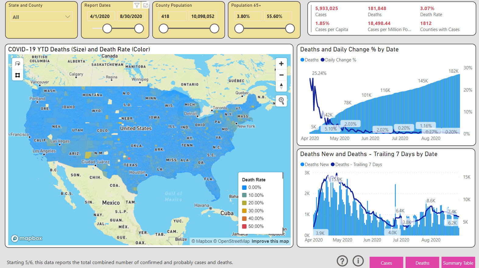
In an effort to make sense of the endless streams of COVID-19 statistics at a state and local level, CEO of Public Insight Data, Dan Quigg took charge of the narrative and transformed the data published by The New York Times into a free interactive report for public use.
Using the Microsoft Power BI tools that were used to build Insight For Work, a self-service analysis platform for the labor market, he created the COVID-19 Dashboard.

The dashboard is fairly self-explanatory, we’ve created this brief video to show you how simple it is to manipulate the filters and drill down to the information you need quickly.
Note: We have made a number of improvements to the Covid-19 dashboard since we created the demo video.
What To Look For
- The dashboard analyzes data down to the national, state, and county level. You can filter the data that you wish to use.
- We provide metrics for cases, cases per-capita, cases per-million, deaths, deaths per-capita, deaths per-million, and death rate. Per-capita and per-million provide population context.
- We have also provided a filter for over 65 populations, because clusters of outbreaks are much more localized to an aging population.
- You can apply any time horizon using the sliders. We have provided seven-day moving averages in the graphs, because daily changes can be fraught with issues.
- The map can really tell a story, for example, if you focus on urban areas (i.e. counties with populations above 3 million), you can see case and death rates that are consistently above the national average. Rural areas are not exempt, consider Indian reservations for example.
- The dashboard is currently updated weekly each Sunday night.
About the Data
- The New York Times data lumps New York City data together, so we have put it in NY County.
- There is less than 1% of data that is not attributable to any county. We have chosen to ignore that data.
Ways To Use This Data
Conceivable usage for this data is endless. Below are just a few ways that one could potentially utilize this information to aid in various occupations. Since our traditional target audiences for Insight For Work includes higher education administrators, Human Resource professionals, and local government officials, we will focus on some applications that would be beneficial to these groups.
Academic Planning
 Learning institutions that cater to students interested in healthcare might utilize the Covid-19 data to ensure that course offerings align with the future needs of public health and wellness.
Furthermore, Covid-19 data can be useful in helping educators determine the safety of hosting on-campus activities. For example, one might make a case for bringing students back sooner if the data shows that Covid-19 cases are on the decline. Alternatively, a school may determine that it is not yet safe to host rallies and events on campus if the data shows that Covid-19 cases are on the rise.

Hiring During Covid-19
There is no question that Covid-19 has drastically impacted recruiting strategies. Before Covid-19, the majority of recruitment activities occurred in person. Today, more employers are recruiting, interviewing and onboarding new hires virtually. Individuals working in a Human Resource-based role can use the Covid-19 case statistics to determine the feasibility of new software allocations to support hiring activities electronically for an extended time.
Allocation of Resources and Planning Ahead
Local government officials need to keep their finger on the pulse to ensure that they have adequate resources in place to handle spikes in cases. For example, a municipality may compare Covid-19 cases to hospitalization capacity to determine if there is a need to invest in makeshift hospitals that can handle the potential overflow.

About Insight For Work
Insight for Work is a self-service analysis platform for the labor market. It combines data from job postings, hiring company profiles and ratings, compensation and benefit surveys, applicant and resumé profiles, and government agency publications with the power of the Microsoft® Power BI business intelligence platform. Instantly analyze occupation, industry, and company opportunities and trends to evaluate strategies and programs and prioritize resources.