New Microsoft® Power BI Visual Dynamically Analyzes Categorical Data
Like fashion goes in and out of style, so do visual ways of exploring data. Several decades ago I worked with a visual called the Decomposition Tree from an upstart company Proclarity from Boise, Idaho to analyze multi-dimensional data. That company was subsequently acquired by Microsoft but the visual never lost popularity. It was the single highest requested visual presentation in the Microsoft Ideas Forum.
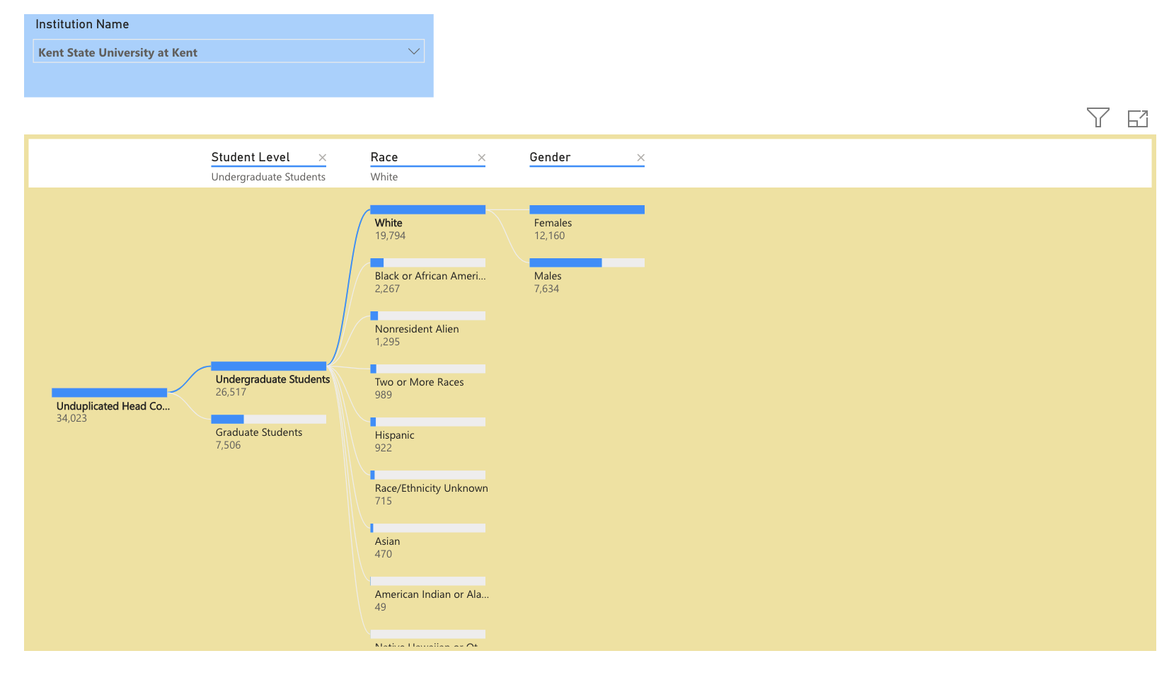
What makes this visual so compelling is it allows the user to browse through categories of data effortlessly. Most categories or dimensions do not have to be thought of as hierarchical. Take head count for example. IPEDS head count has three built in categories of data – student level, race, and gender. The decomposition (decomp) tree allows you to explore the different categories in sequence – the more categories, the more flexibility. The decomp tree provides a level of flexibility that citizen data scientists love. The three minute video illustrates the power of this tool.
The artificial intelligence features of the decomp tree are Microsoft’s attempt to provide built-in intelligence to the visual. We might think of these tools as consumer artificial intelligence. The AI component of the visual allows you to determine which categories have the most or least influence on the visual.
The Insight for Higher Education (IFHE) dataset provides built in capability to take advantage of the decomp tree. For example, there are over 100 dimensional attributes that describe higher education institutions in the dataset. In the video example below, we show several ways of analyzing head count using the decomp tree.
We have created a public visual below that allows you to play with the consumer features of the decomp tree. Simply select the institution and click on the nodes. You can also close categories and play with different category paths such as race, then gender, then level.
About Public Insight
Public Insight transforms the islands of public data into actionable insights with analytic datasets and Microsoft® Power BI to better understand your industry and market. Insight for Higher Education is an easy-to-use executive planning and analysis application for benchmarking higher education institutions across a wide range of topical areas such as enrollment, graduation rates, degrees awarded, and staffing. Sign up for a free Factbook Interactive to explore how easy it is to navigate through public data.