Where the Vets Live

As we approach this Memorial Day Weekend, we pause to remember the sacrifice made on our behalf by our veterans. Nationwide veterans comprise 8% of the population. But there are clusters of populations where veterans comprise much higher percentages of the population. This article from Trulia published in Forbes back in 2014 suggests that veterans tend to be in smaller cities near military bases. 


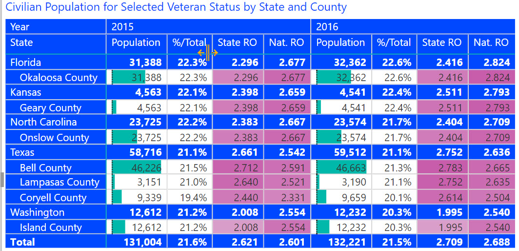
We found seven counties where veterans comprise more than 20% of the general population. Several like in Texas and west Florida are concentrated around military bases. However, having a military base does not necessarily ensure a high veteran population. There are many military bases for example in California, but have a low percentage of veteran population. The article suggests a more rural population for veteran concentrations with high home ownership, older population, and low diversity. The average county population of the seven counties is 132,000, but the average age of 34 is substantially less than the national average at 41. As the article suggests, U.S. Citizenship of veteran concentrations is much higher than the national average at 54% vs. 47%.



Share This Story

Similar Posts

  • Decoding Outcome Measures Data

    Breaking Down the Second Year Student Success Measure The IPEDS Outcome Measures data was designed as a supplement to graduation rate data which has always been questioned as an effective measure for measuring student outcomes. Outcome Measures is now in year two of its collection and provides a lot of…

  • How Long Should You Wait in the Emergency Room?

    We recently had a health scare where a family member spent over 12 hours in the emergency room. While she was not thrilled to spend so much time there, she did ultimately get good medical care. So what is excessive time in the emergency room?   Centers for Medicare &…

  • Students Moving Back on Campus

    The number of students living on-campus for the approximately 4,500 non-state institutions has increased from just over 43% in 2011 to nearly 53% just four years later in 2015. The pie graph below shows the movement from 2011 to 2015 with the yellow slice indicating the percentage of students living…

  • Will Voter Unpredictability Continue in 2018?

    Much has been written about the increased polarization of America and its collective impact on communities. There were many surprises in the 2016 election and people are bracing for a potentially tumultuous 2018 mid-term election. Ohio, where I live, is one of the swing states. The average county in Ohio…

  • On Faculty Compensation and Gender Disparity

    It will take many years for the faculty gender pay gap to close at the current rate of change. From 2014 to 2015, women received around half a percent higher pay increase from men over the various institutional sectors. There is still a 16% and 14% gender pay gap for full professors…

  • COVID-19 Dashboard with NYT Data

    Analyze COVID-19 Cases by National, State and County Level It is important for today’s business leaders to consider the impact of COVID-19 when making decisions and allocating resources. The accuracy of COVID-19 data reported by news sources and online publications goes beyond the numbers themselves, the interpretation of the statistics…