EVICTED – The Impact of Housing Affordability

I was in the Bay Area this week for a health technology conference at Stanford University. I took Lyft back and forth from where I was staying. While conversing with one driver in my rudimentary Spanish, I found out that his family was spending $3,000 a month for a two bedroom, one bath home. He was working 16 hour days just to plow a large part of that income towards their rent. I am reading the book Evicted which describes the plight of inner city families to stay in one place. The downstream impact on our urban social infrastructure is staggering.


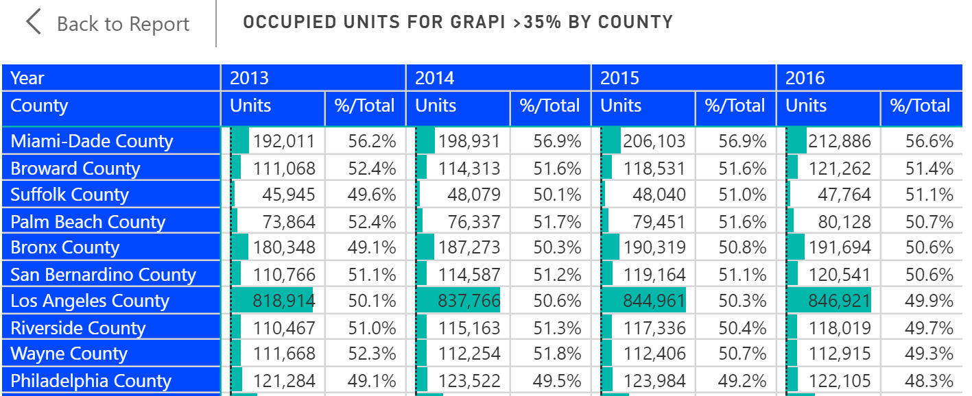
The American Community Survey collects a statistic on the number of housing units where the occupants spend more than 35% of income on rent. It is GRAPI or Gross Rents as a Percentage of Income. Nationwide, 42% of housing units spent more than 35% on rents, but in counties where the population is greater than 1 million residents, that number can cross 50%. The top ten counties for GRAPI with populations above 1 million residents are shown below. It is unfortunate that the ACS survey ends with a band at 35% because it would not be surprising to me to see homes where 70% or more of income goes towards housing.


We have curated housing data from the American Community Survey into 25 indicators as part of the Population Analysis Interactive including GRAPI. Here at Public Insight, we love to put data to work into creating useful insights. We believe that the power of curated data and business intelligence is extraordinary. We’d love to hear from you and be of help to you and your organization.  
Share This Story

Similar Posts

  • When is a Job Essential?

    Critical Infrastructure Accounts for 60% of Jobs as the Rest Open Up The stay-at-home orders under the COVID-19 pandemic separated “essential” from “non-essential”. Businesses deemed essential stayed open. Those that were not essential shut down. Sometimes those lines were very blurred with individual states and even communities making those choices…

  • COVID-19 Dashboard with NYT Data

    Analyze COVID-19 Cases by National, State and County Level It is important for today’s business leaders to consider the impact of COVID-19 when making decisions and allocating resources. The accuracy of COVID-19 data reported by news sources and online publications goes beyond the numbers themselves, the interpretation of the statistics…

  • When is Free Tuition Really Free?

    The sticker pricing game has been in place a long time. No one ever pays full sticker price for items such as jewelry or cars. That is probably why University of Michigan came under scrutiny for its free tuition guarantee for families with income under $65,000. Cynics pointed this out…

  • FAFSA Application Volume Down 11%

    The FAFSA Application Volume declined nearly 11% for the application cycles from June 30, 2014 through June 30, 2017 based on data from Federal Student Aid and analyzed using the Financial Aid Interactive. FAFSA application cycles are based on an 18-month period for any one particular school year.  Note the…

  • Death Rate Continues to Inch Up

    The mortality (or death) rate increased nominally from 2016 to 2017 going from 844 to 849 deaths per 100,000. This probably is not earthshaking news but based on the overall crude rate, it has actually been increasing since 2009 as noted by the following graph.   Advances in medical care…