Are Outpatient Imaging Quality Measures Effective?

CMS began developing measures evaluating imaging efficiency back in 2007. These performance measures have been distributed as part of Hospital Compare for the past four years. Lower percentages suggest more efficient use of medical imaging. The purpose of reporting these measures is to reduce unnecessary exposure to contrast materials and/or radiation, to ensure adherence to evidence-based medicine and practice guidelines, and to prevent wasteful use of Medicare resources. We looked at this data using the Quality Ratings Interactive which analyzes all of the quality ratings measures from CMS.

  • Overall, imaging performance across the six measures has declined over the past four years or remained flat (MRI for lower back pain has not changed much).

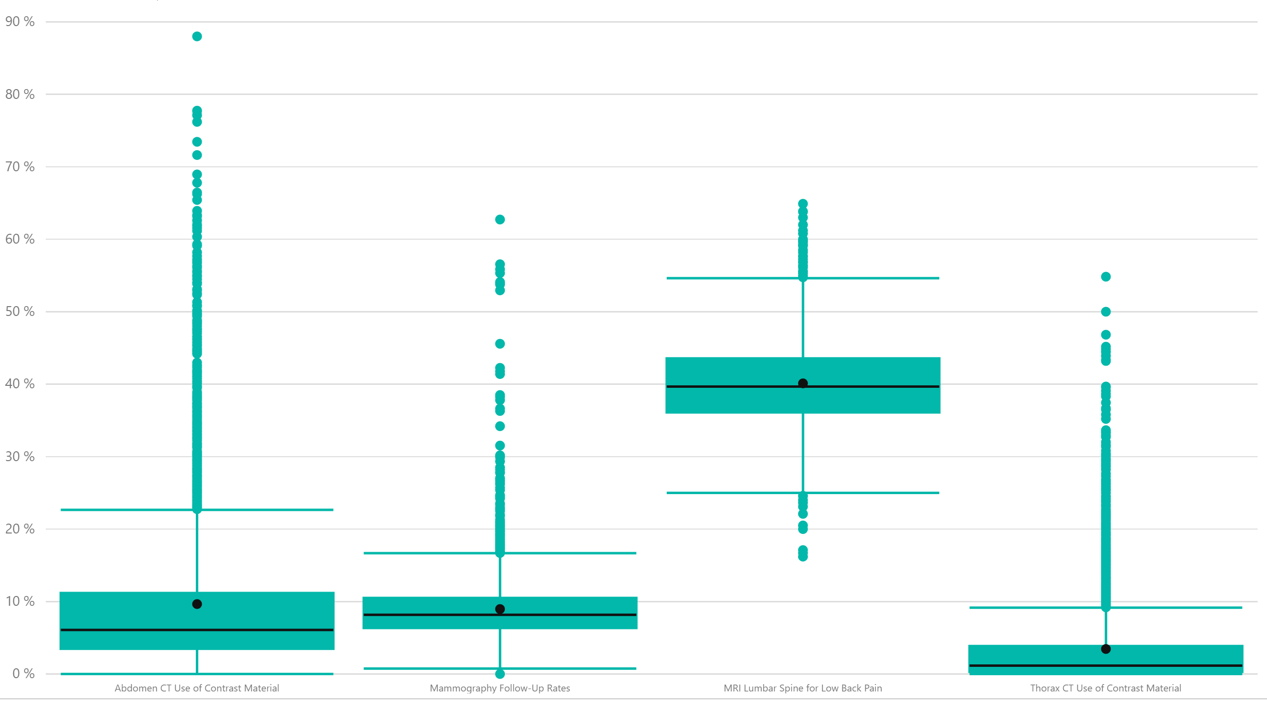
  • However, there is incredible variability among hospitals across all of the imaging measures as shown in the box and whiskers plot below. 

We picked four of the measures to illustrate. The line indicates the median of the performance rate with the inner and outer lines representing the inner two quartiles. Anything outside of that is an outlier. We can see that the number of outliers covers a very wide range of results and even within the inner quartiles, there is a pretty wide range of results (see MRI of the back in particular). Further, the variability has not changed a whole lot over the trailing four years. 


The Lewin Group was contracted by CMS to perform an assessment on these performance rates and they make some interesting observations in their research. You can find these studies on the QualityNet site.
 

Share This Story

Similar Posts

  • Hot Jobs, Growing Wages, and Weird Titles

    I love looking at the Bureau of Labor Statistics Occupational Employment Statistics data. This data produces employment and wage estimates annually for over 800 occupations and estimates for states and metropolitan areas. I especially enjoy looking at this data from both a job growth and a wage growth perspective. That…

  • Friendly Skies Just Got Friendlier

    Airlines have taken it on the chin in recent months for bad customer service. This despite the fact that overall customer service rankings of the airline industry are up. Flight attendants received nearly a 14% bump in pay based on a comparison of mean wage data from the 2016 Occupational…

  • When is a Job Essential?

    Critical Infrastructure Accounts for 60% of Jobs as the Rest Open Up The stay-at-home orders under the COVID-19 pandemic separated “essential” from “non-essential”. Businesses deemed essential stayed open. Those that were not essential shut down. Sometimes those lines were very blurred with individual states and even communities making those choices…

  • Infection Procedures Top Inpatient Volume Growth

    While Medicare inpatient procedure volume has remained flat since 2013, infections are a significant area of high volume change. The treemap below from the Inpatient Procedure Analysis Interactive shows the inpatient volume growth by procedure with color coding by volume change from 2013-2015 using the Medicare Provider and Analysis Review…

  • Lower Student Default Rates – Calm Before the Storm?

    Loan repayment rate data may trigger resurgence in default rates The most recent Federal Student Aid student default rate data indicates that the composite student default rates declined from 10.8% in 2015 to 10.1% in 2016, a decline of 6.5% and continuing a seven-year post-recession trend. In 2010, the default…

  • On Faculty Compensation and Gender Disparity

    It will take many years for the faculty gender pay gap to close at the current rate of change. From 2014 to 2015, women received around half a percent higher pay increase from men over the various institutional sectors. There is still a 16% and 14% gender pay gap for full professors…