What do Sierra Vista and Hinesville Have in Common?

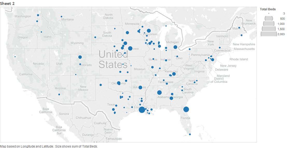
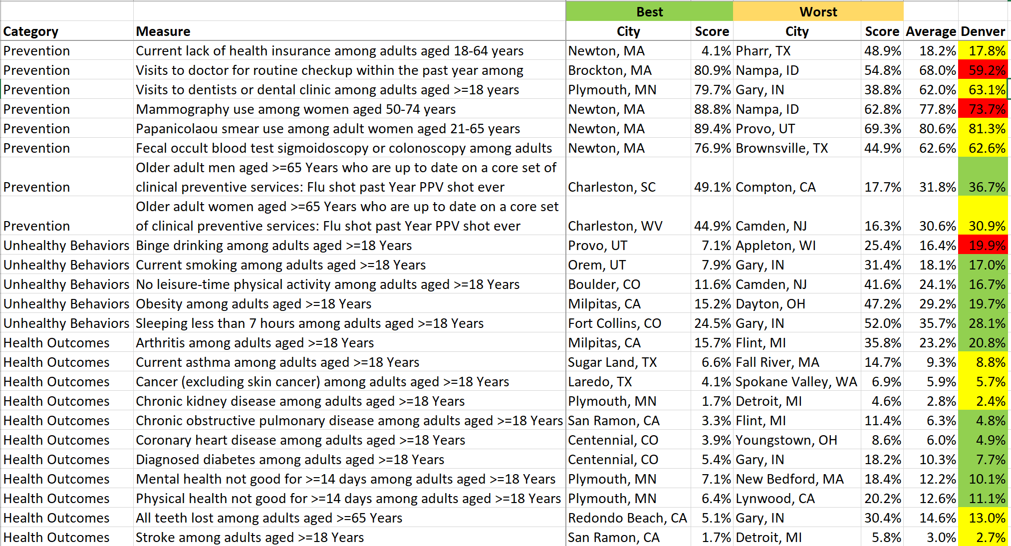
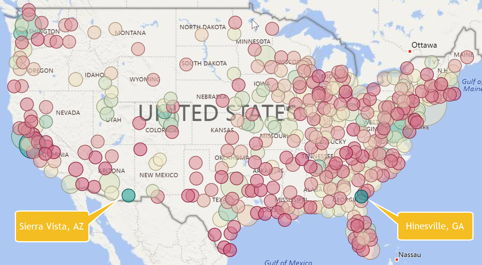
Sierra Vista, AZ and Hinesville, GA probably don’t seem to have much in common. One is in eastern Arizona and the other is in southeast Georgia. They are both very small cities with populations of around 40,000. What they have in common is a market concentration for computer occupations with a location quotient of around four times the national average. These two markets pop out when you show a map of metropolitan areas color coded for location quotient as shown below. Markets with a high saturation for computer occupations are a cyan color while those with lower saturation are in red.


Location quotient reveals market concentration because it compares the local region (metro area in this case) to the nation. The size of the points in the map above is the absolute number of jobs (computer occupations in this case). A market like Chicago has a high number of computer jobs but it is not concentrated compared to the nation. In other words, it has the expected number of computer jobs compared to all other occupations for that size market. 


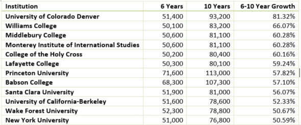
We have updated the popular Degree-to-Jobs Interactive to include the latest data from the Occupational Employment Statistics survey for 2017. This Interactive includes job and wage analysis by market for over 800 job occupations with crosswalks to CIP codes for program planning and analysis. This update is automatically available to our subscribers. You can purchase this as an individual Interactive for $295 or as part of the Higher Education Institution library


Share This Story

Similar Posts

  • Rural Hospitals are Five-Star According to CMS

    Los Angeles County, CA and Cook County, IL (Chicago) have 117 CMS rated hospitals between them and over 15 million residents. Yet, there is not a single five-star hospital in either county. In this mini-series, we have examined the profile of the current 188 five-star hospitals as it marks its…

  • Tuition Bears Increasing Brunt of Higher Ed. Revenue

    In 2011, Tuition and Fees represented 20.6% of public institutional revenue. In 2015, it has increased to 24.25%. Most of the reshuffling of revenue has come from federal operating grants and contracts as noted by the graphs below. Interestingly, state appropriations have remained relatively constant. Similarly, non-profit institutions have seen tuition…

  • STEM Enrollment Fields Show Strong Growth

    The IPEDS Enrollment by Major Fields of Study is collected every other year and 2016 is a new reported year. IPEDS collects nine major fields of study and the enrollment is disaggregated by attendance status (full-time, part-time), level (undergraduate, graduate), race, and gender.   There are numerous ways to breakdown…

  • College Building Boom Approaches $1 Trillion

    Postsecondary institutions continue to invest heavily in capital assets and the cumulative investment across public and private institutions has crossed $900 billion, an increase of 27% over a five-year period. The capital investment growth rates are almost identical for both public institutions and private non-profit institutions as noted in the…

  • Have Student Debt Repayment Rates Bottomed?

    Student repayment rates continues to decline, although the trend seems to be slowing, according to the most recent College Scorecard data. This data measures repayment rates at 1,3,5, and 7 years. Repayment rates and default rates are very different. Repayment rates are the percentage of students who have made progress…

  • Lower Student Default Rates – Calm Before the Storm?

    Loan repayment rate data may trigger resurgence in default rates The most recent Federal Student Aid student default rate data indicates that the composite student default rates declined from 10.8% in 2015 to 10.1% in 2016, a decline of 6.5% and continuing a seven-year post-recession trend. In 2010, the default…