Student Default Rates for 2014 Flatten at 15.4%

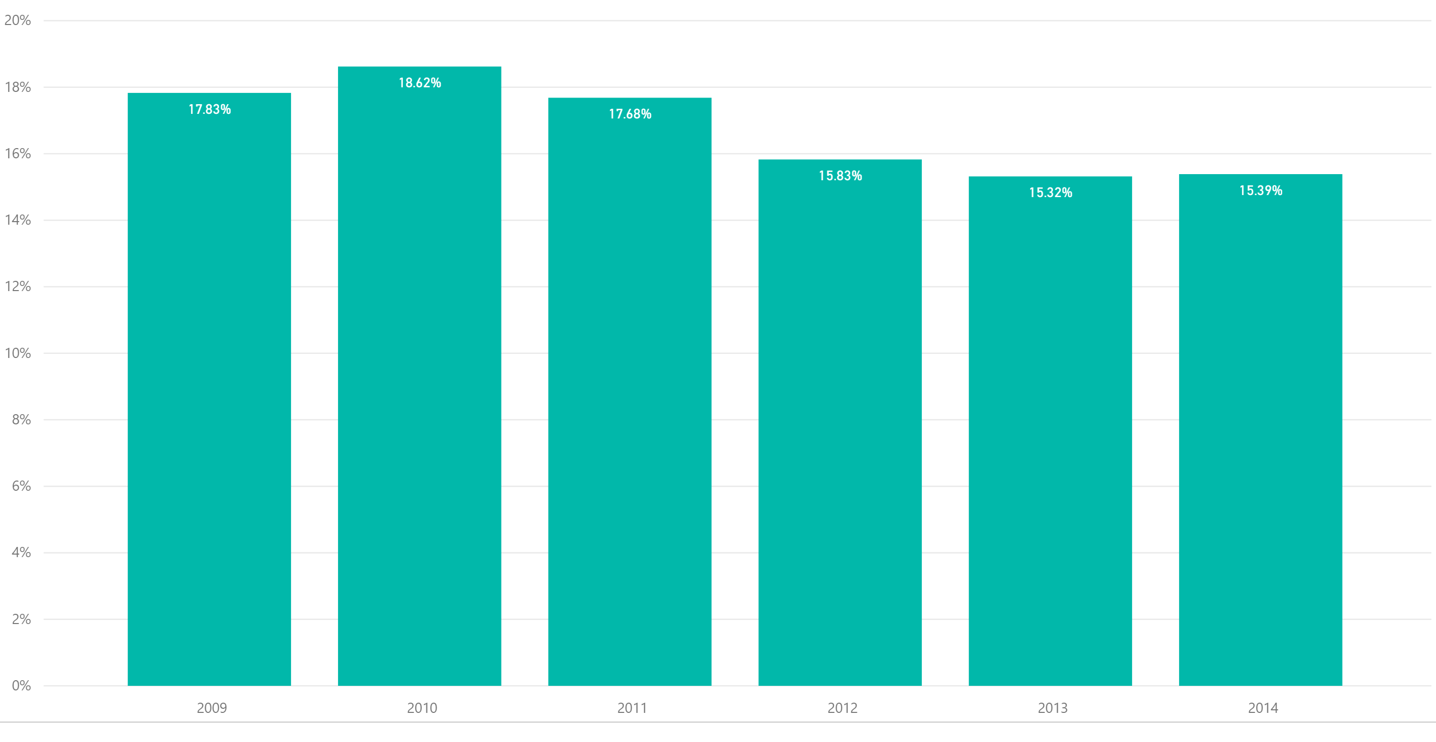
Last week we looked at student repayment rates and noted that longer-term repayment rates continue to decline for five and seven year repayment periods. Repayment rates are in essence a measure of optimism as it is the percentage of students who have made progress in paying down their student loans. This week, we are looking at measures of pessimism which are student default rates. The most recently published student default rates, when weighted for cohort size by institution, shows that student default rates were ostensibly flat from 2013 to 2014. Default rates are defined as a failure to repay a loan according to the terms agreed to in the promissory note. For most federal student loans, a default is if a payment has not been made in more than 270 days. The 2014 numbers represent about 630,000 borrowers in default.


Student Default Rates


However when looking more closely at the default rates by sector, we noticed that the private non-profit under two year institutions show an alarming increase in default rates from 22-27%. However, it is less than 1% of the students in default and still an improvement from 2009 when it was over 30%. Most of the sectors appear to be flat in change. As noted previously, student default rates can be a moving target as loans can be refinanced. Default is often a last resort and therefore default rate is a lagging indicator.


Default Rates by Sector


Share This Story

Similar Posts

  • Powerball and Endowment Wealth per Student

    Large dollars tend to attract many of us. That is why the Powerball attracted so many people at the tidy sum of 1.3 billion. Yet the larger the number, the more people participate. Someone had the brilliant idea of distributing Powerball winnings to everyone in the country thinking it would…

  • Inpatient vs. Outpatient – What the Numbers Show

    Analysts in health care don’t agree in unanimity very often, but most seem to agree that there will continue to be a quantum shift in healthcare from inpatient to outpatient. In this two part series, we will attempt to quantify and support this important trend. We utilized the Beds and…

  • Death Rate Continues to Inch Up

    The mortality (or death) rate increased nominally from 2016 to 2017 going from 844 to 849 deaths per 100,000. This probably is not earthshaking news but based on the overall crude rate, it has actually been increasing since 2009 as noted by the following graph.   Advances in medical care…

  • Regional Variations in Opioid Prescribing Rates

    Given the state of the opioid crisis, any meaningful data is valuable. So when CMS released three years of Opioid Part D prescription data in November, we all rejoiced. CMS also released a mapping tool to analyze the data. While mapping tools can be effective, they can also get in…

  • Visualizing Student Debt and Earnings

    Leveraging Scatterplots to Analyze the New College Scorecard Data There has always been a symbiotic relationship between student debt and student earnings. As student debt has creeped up in recent years, there has also been a data gap with post-graduation earnings. The most recent College Scorecard data is a first…