Breaking Down the Second Year Student Success Measure
The IPEDS Outcome Measures data was designed as a supplement to graduation rate data which has always been questioned as an effective measure for measuring student outcomes. Outcome Measures is now in year two of its collection and provides a lot of useful information. However, it also has a lot of moving parts.
Outcome Measures Reports 192 Possible Buckets
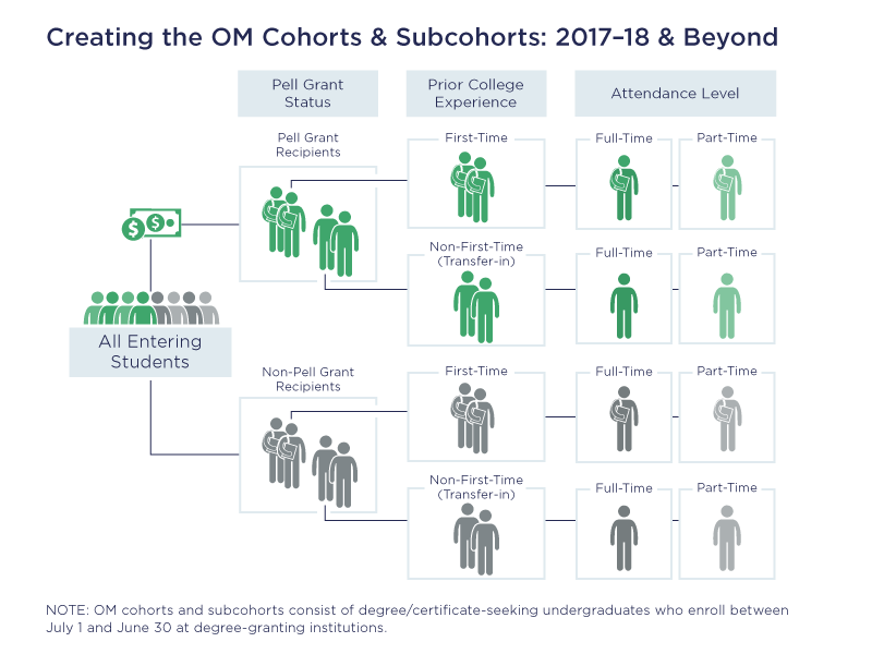
The challenge with the Outcome Measures is that there are 192 possible outcomes for any given institution (isn’t math fun!) based on combinations of the following:
- As noted in the infographic below, there are four reporting cohorts based on attendance level and prior college experience.
- Those are further separated into three subcohorts for financial aid status (including all students).
- There are sixteen possible reporting outcomes. Outcomes include:
- Award received within four, six, and eight years
- The type of award received (certificate, associates, bachelors)
- If they did not receive an award, what is their status after eight years if known.

A further complication is that the measures overlap. For example, a student receiving a degree at four years would also be included in eight years. The award status is based on receipt within the measuring interval.
Composite Student Outcomes at Eight Years
In 2018, there were just over 8.8 million students in the adjusted cohort across all reporting cohorts:
- 37.9% of students received an award within eight years
- 1.5% are still enrolled at eight years
- 25.5% transferred to a different institution within eight years
- 34.1% have an uncertain status at the eight-year mark
Over one-third of students are unaccounted for in the measure. This number is down slightly from 35.6% in 2017 indicating a possible improvement in tracking these students.
I like to visualize the Outcome Measures as a funnel as shown below. We can then see immediately then the relative performance at different intervals.

We have created a free Interactive to allow you to quickly navigate through the Outcome Measures for any individual institution for 2018 or 2017. We have split the outcomes into two segments – one for completers and one for non-completers. You can also select the cohorts and subcohorts. The Insight for Higher Education Interactive provides further options to break down this data including groups of institutions and comparisons.
In our next post, we will apply the same logic to the College Scorecard Title IV Outcomes data which is even more complicated. Stay tuned!
About Public Insight
Public Insight transforms the islands of public data into actionable insights with analytic datasets and Microsoft® Power BI to better understand your industry and market. Insight for Higher Education is an easy-to-use executive planning and analysis application for benchmarking higher education institutions across a wide range of topical areas such as enrollment, graduation rates, degrees awarded, and staffing. Sign up to access a free Factbook Interactive or request a 15-day trial to explore how easy it is to navigate through public data.