CMS Releases 2016 Opioid Prescription Data

This week, CMS released 2016 Opioid Part D Prescribing Rates data which follows on the heels of the original release several months ago. This data release includes Opioid prescriber, claims, and extended release claims at the national, state, county, and zip code level. We have updated our Opioid Prescribing Rates Interactive to include the new data and have drawn some immediate conclusions at a national level:

  • The number of Opioid prescribers as a percentage of overall prescribers has declined from 45.5% to 44.3%. 

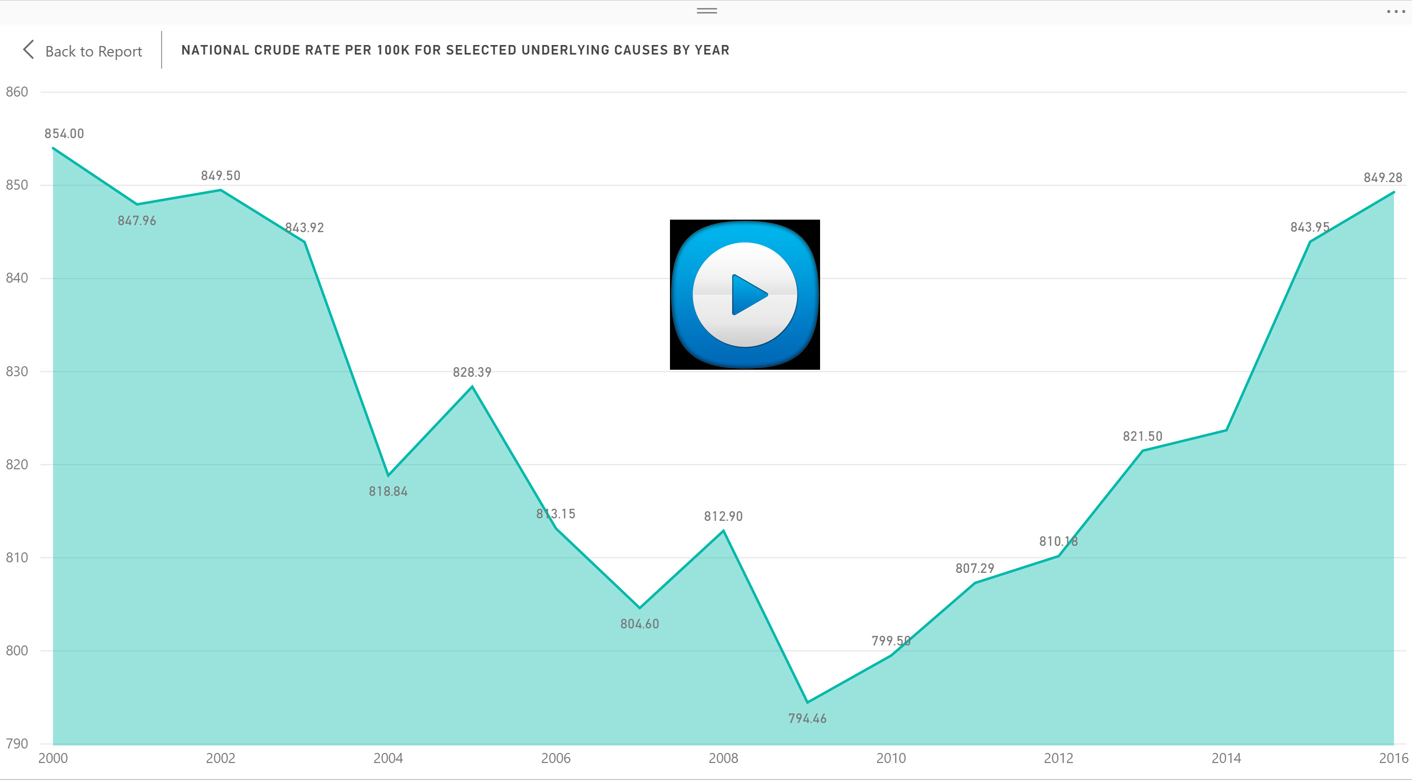
  • The Opioid prescription claims as a percentage of all Part D claims has declined to 5.35% from 5.52%, the fourth straight year of decline.

  • Extended release claims continue to migrate up for the fourth straight year from 6.71% to 6.92%. Extended release mitigates the potential risk of opioid overdose.

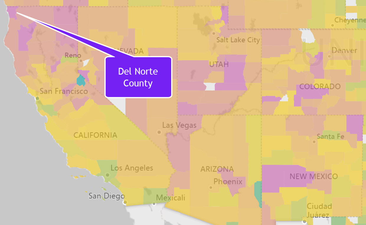
Regionally, there continue to be significant variations in opioid activity. At a state level, Alabama has the highest proportion of Opioid claims to overall claims percentage at 7.47%. While smaller counties may have regional anomalies, there are some major regional differences. For example, counties like Del Norte in northern California have shown a much higher than national average as shown in the map below.  Del Norte has over 2.3x the national average for opioid claims.


The Opioid Prescribing Rate Interactive dynamically analyzes regional opioid claims, extended release claims, and provider data at the national, state, county, and zip code levels. This Interactive is part of our Community Health library and is also available individually for $295. 
 

Share This Story

Similar Posts

  • Diving Deeper into Opioid Prescriber Data

    Last week we introduced the new CMS opioid data set and what it means. This data tries to initiate transparency around this hot topical area even though Part D Medicare claims may not be the best proxy of all opioid prescription activity. There are three elements to this data: Part…

  • Distance Education Rebounds

    Distance Education is now 12.3% of all programs and up 7.6% in 2018 Social distancing, at least for now, is the new normal and along with it comes distance education. Each year we look at what the data is telling us for distance education programs. Last year, I suggested that…

  • Degrees, Jobs, and Crosswalks

    My daughter has a Bachelor’s Degree in Fine Arts with a concentration in Cartooning and Illustration. Today, she is a quality assurance manager for a software company. I am very glad that her career has morphed into a burgeoning field because it was very clear to me that it would…

  • Student Earnings Experience a Sluggish Recovery

    College students are earning 8% less in 2013 than in 2008 per the most recent data published by the US Department of Education College Scorecard database. Students earned $31,382 in 2013 compared to $34,119 in 2008. The earnings were ostensibly flat from 2012 earnings of $31,528.   The College Scorecard…

  • Tuition Bears Increasing Brunt of Higher Ed. Revenue

    In 2011, Tuition and Fees represented 20.6% of public institutional revenue. In 2015, it has increased to 24.25%. Most of the reshuffling of revenue has come from federal operating grants and contracts as noted by the graphs below. Interestingly, state appropriations have remained relatively constant. Similarly, non-profit institutions have seen tuition…