How Healthy Are U.S. Hospitals?

If we said that 20% of any industry was at financial risk, we would all be up in arms. However, a recent Morgan Stanley report citing that statistic was met with some degree of yawning. The report cites that 450 hospitals are at risk of closure and another 600 are “weak”. 


With over 90% of hospitals now having reported financials to Centers for Medicare & Medicaid Services (CMS through HCRIS) for 2017, we took at look at the median financial metrics across the industry and are finding some alarming results:

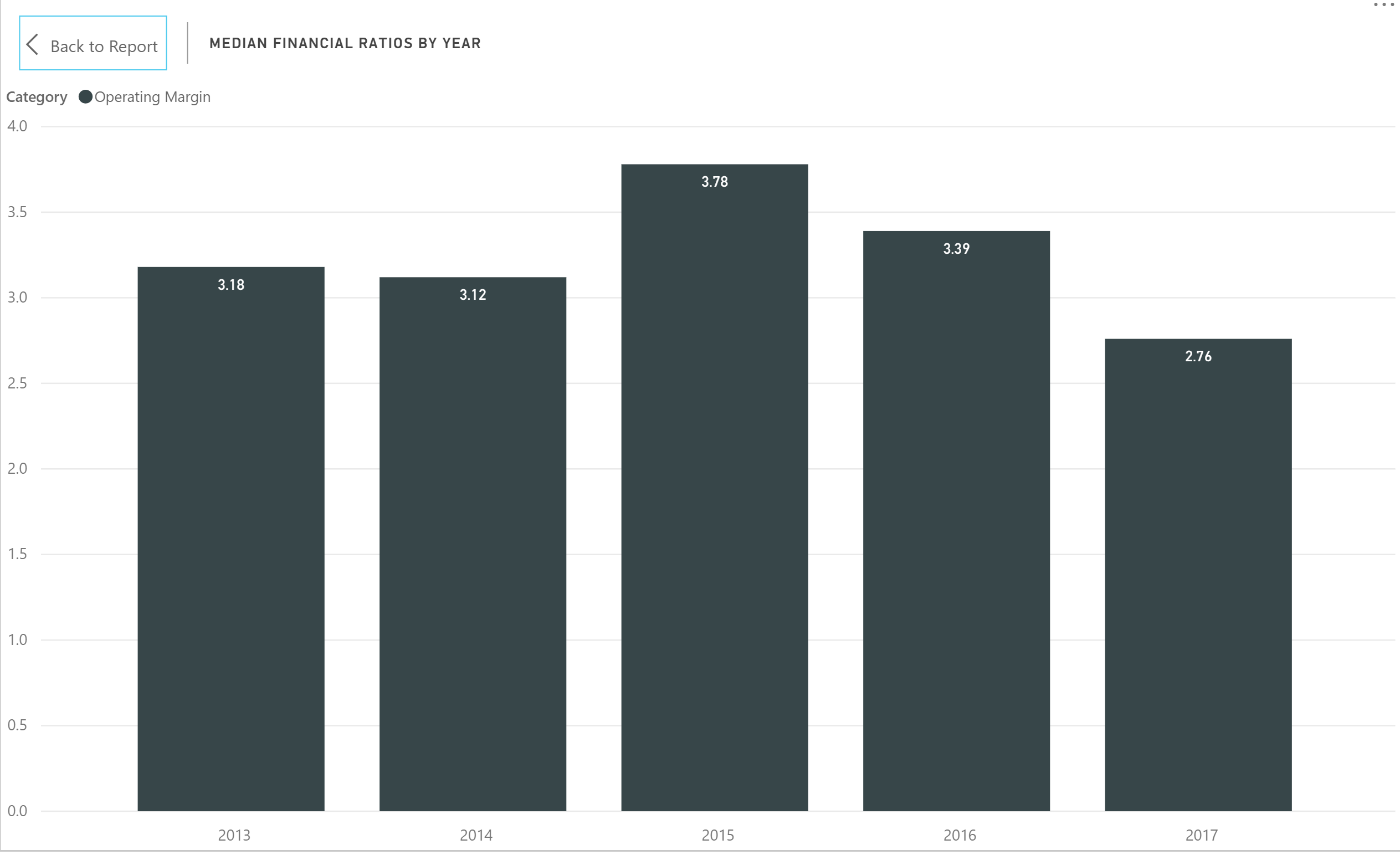
  • Operating margin declined from 3.39% to 2.76%, a five year low (see image below).

  • Days cash on hand has dwindled to 26 days, a decline of 13% since 2013 with days cash on hand from short-term sources declining even further by nearly 30% to just over 10 days.

  • Fixed asset financing is also at a five-year low. One of the benchmarks of the Morgan Stanley report was a lack of capital improvements in the face of a need for increasing capacity.

  • On the positive side, the average payment period continues to decline and is also at a five-year low of 48.4 days.

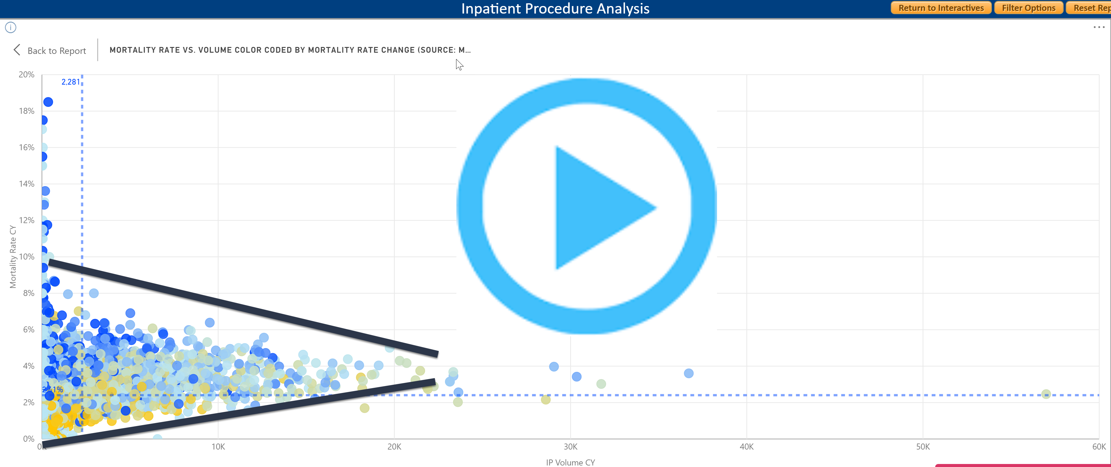
The recently released Insight for Healthcare Interactive provides rapid insights into the healthcare provider ecosystem. The Advanced and Master versions contain financial and utilization metrics for over 7,000 hospitals with filters for geographies and hospital attributes.  


Share This Story

Similar Posts

  • CDC Publishes 2016 Natality (Births) Data

    The CDC recently released updated Natality (Births) data for 2016. State laws require birth certificates to be completed for all births, and Federal law mandates national collection and publication of births and other vital statistics data. The National Vital Statistics System provides access to statistical information from birth certificates and CDC makes…

  • Tuition Bears Increasing Brunt of Higher Ed. Revenue

    In 2011, Tuition and Fees represented 20.6% of public institutional revenue. In 2015, it has increased to 24.25%. Most of the reshuffling of revenue has come from federal operating grants and contracts as noted by the graphs below. Interestingly, state appropriations have remained relatively constant. Similarly, non-profit institutions have seen tuition…

  • Death Rate Continues to Inch Up

    The mortality (or death) rate increased nominally from 2016 to 2017 going from 844 to 849 deaths per 100,000. This probably is not earthshaking news but based on the overall crude rate, it has actually been increasing since 2009 as noted by the following graph.   Advances in medical care…

  • Student Debt Rises 13%

    The newest College Scorecard data released several weeks ago reveals an ongoing trend in student debt. The median student debt increased 13.1% from 2015 to 2016. The median student debt has now more than doubled since 2007 as shown by the following graph. We calculated this using a weighted average…

  • As the Economy Grows, So Does Poverty

    There is a general perception that a rising economy raises all economic boats. But poverty rates would indicate that the poorest of the poor just seem to get poorer. Many counties have actually experienced a rise in poverty rates from 2012 to 2016. We took a quick look at the…