The Aging of Housing in America

They are building three new homes across from my house here in Northeast Ohio. It seems we are past the time of the severe slowdown of housing starts and there has been a mini-housing resurgence. Home inventory levels remain low. The problem is, like my new neighbors, new housing tends to be on vacant land.


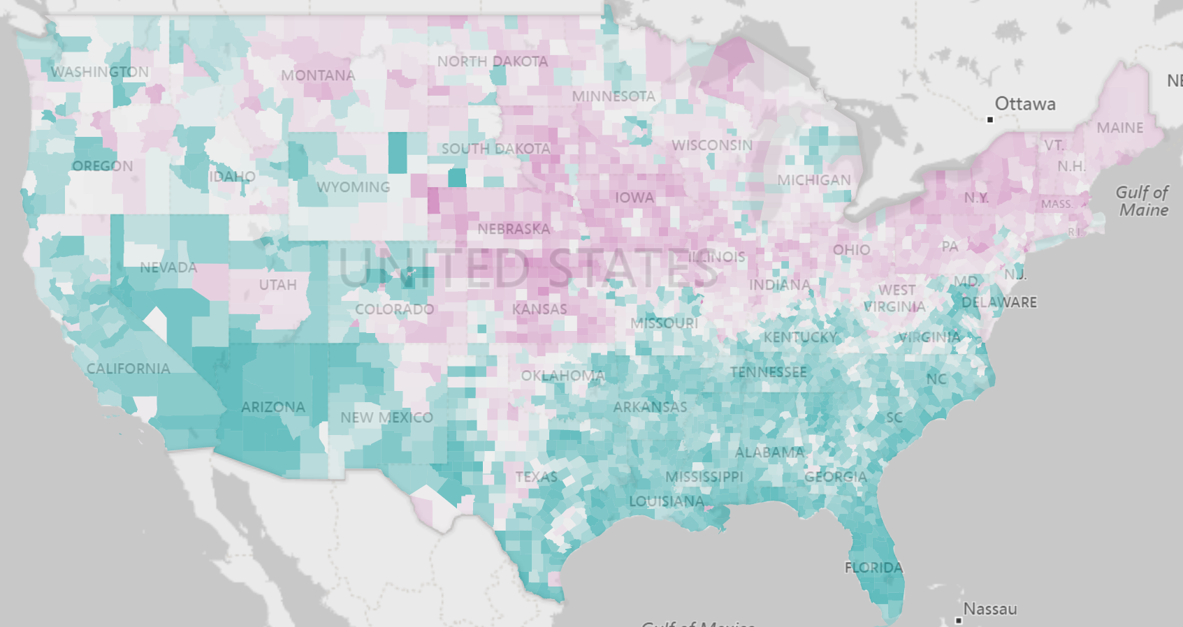
A very high percentage (12.9%) of homes still exist in the U.S. that were built prior to 1940. Next to homes built in the 1970’s, this is still one of the highest home categories based on age.  These homes primarily dot the landscape of our urban areas. There are 208 counties where 30% or more of the homes were built prior to 1940 and the weighted average population is just under 1 million. These homes also are heavily concentrated in the north as indicated by the magenta colors in the map below. 


There are numerous issues associated with older housing ranging from blight to upkeep to fire hazards. This article provides a nice overview.  


We have curated housing data from the American Community Survey into 25 indicators as part of the Population Analysis Interactive including age of structure.  We are committed to bringing disparate community data to life to inform community health and regional prosperity. 


Share This Story

Similar Posts

  • Is Education Required for Fast Growing Jobs?

    A hot topic, especially when new job projections come out, is whether the high growth jobs require much in the way of education. Jed Kolko at Indeed Hiring Labs did a very thorough job of analyzing projected occupational growth against their respective education requirements. His conclusion was that the slower…

  • Maternal Care and Rural Counties

    An interesting study published in the September issue of Health Affairs found that 9 percent of rural counties experienced the loss of all hospital obstetric services in the period 2004–14. In addition, another 45 percent of rural US counties had no hospital obstetric services at all during the study period. We…

  • Regional Variations in Opioid Prescribing Rates

    Given the state of the opioid crisis, any meaningful data is valuable. So when CMS released three years of Opioid Part D prescription data in November, we all rejoiced. CMS also released a mapping tool to analyze the data. While mapping tools can be effective, they can also get in…

  • Distance Education Programs Growth Up 18%

    After a few weeks break, we are back with this week’s edition of the Insight for Education blog. In my previous blog on distance enrollment, we cited that distance enrollment exclusive growth was up nearly 15% and more and more schools were offering distance education. In this analysis we wanted…

  • Black Disparities in Premature Death

    County Health Rankings has always used Premature Death as a measure in deriving its ranking formula. Years of Potential Life Lost Before Age 75 (or YPLL) counts as 50% of the Health Outcomes score. Every death occurring before the age of 75 contributes to the total number of years of potential…

  • Income Inequality Marches On

    Welcome to 2018!  We are making some fundamental shifts to our Weekly Insights which I hope you will enjoy.  We are moving our content towards more video and free self-service analysis around our weekly topical theme. We welcome your feedback and your ideas.    Over 70% of population health is…