BLS Releases New 10-Year Employment Projections

Last month, the Bureau of Labor Statistics released its 10-year employment projection data. This data is updated every other year. The new data shows a projected increase over the next decade of 7.4% which is a noticeable increase over the previous 6.5% 10-year projections in 2014. These projections are not so much driven by economic growth as population growth. Implicit in the forecast are assumptions about future fertility and mortality rates of the U.S. population. Also included are assumptions about immigration, the most uncertain but important factor affecting the size of the future labor force.


BLS produces occupational employment projections by analyzing current and projected future staffing patterns (the distribution of occupations within an industry) in an industry−occupation matrix. Changes in the staffing pattern for each industry are projected and applied to the final industry projections, yielding detailed occupational projections by industry. Employment growth is projected for nearly all occupational groups, from healthcare to transportation occupations. The only occupational group projected to decline from 2016 to 2026 is production occupations, at a rate of 4.1 percent.


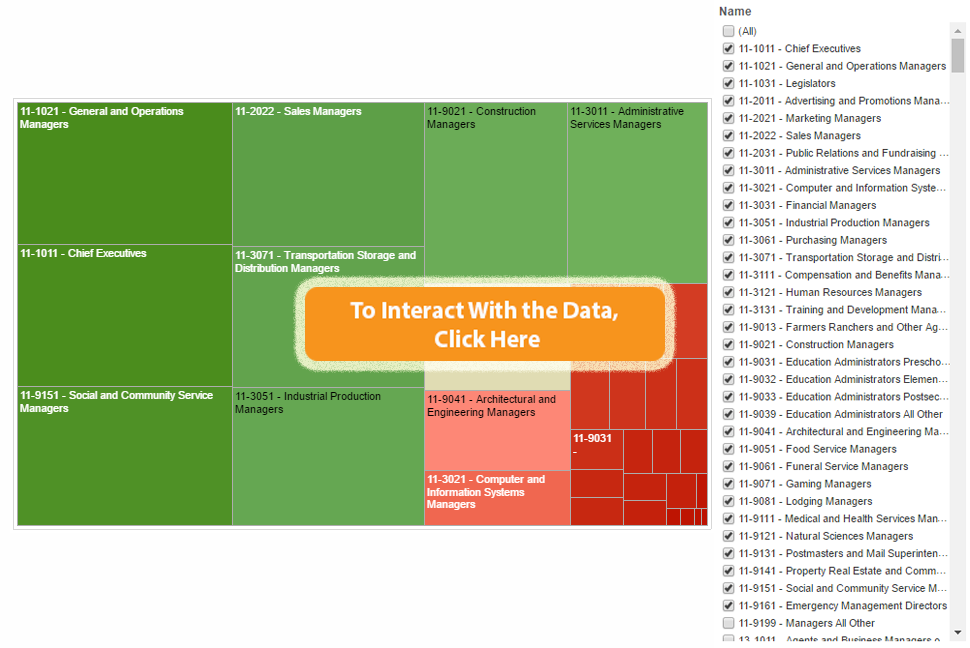
The Degree-to-Jobs Interactive leverages these employment projections as part of this unique program planning tool. The updated 2016 projections will be incorporated into the Degree-to-Jobs Interactive shortly. The data is now also available for free for registered users to browse in Data Browser


The BLS Employment Projections has some new information that we will spend the new few weeks discussing. Note there will be no Weekly Insights next week for the Thanksgiving holiday. 


Share This Story

Similar Posts

  • Regional Variations in Opioid Prescribing Rates

    Given the state of the opioid crisis, any meaningful data is valuable. So when CMS released three years of Opioid Part D prescription data in November, we all rejoiced. CMS also released a mapping tool to analyze the data. While mapping tools can be effective, they can also get in…

  • Death Rate Continues to Inch Up

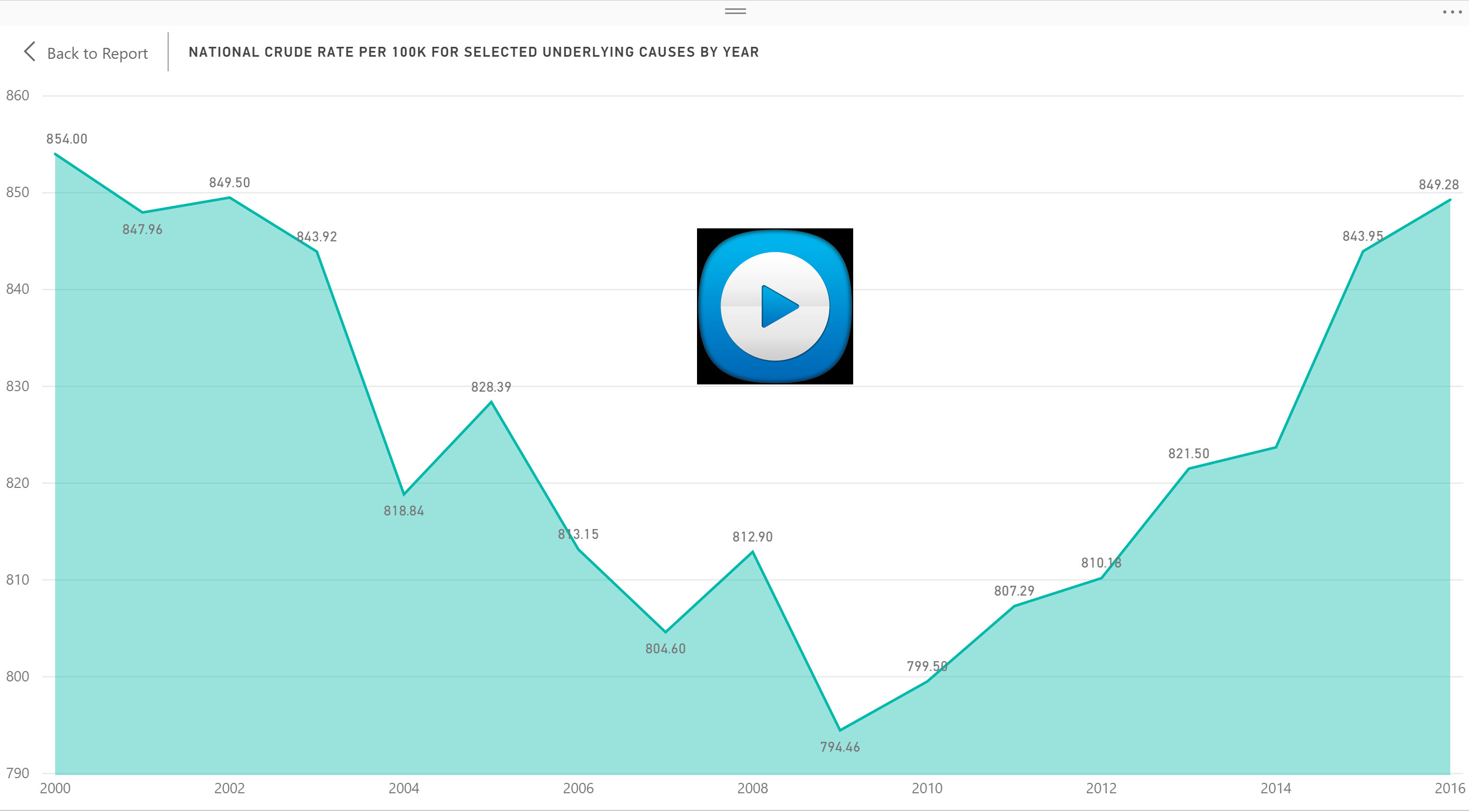
    The mortality (or death) rate increased nominally from 2016 to 2017 going from 844 to 849 deaths per 100,000. This probably is not earthshaking news but based on the overall crude rate, it has actually been increasing since 2009 as noted by the following graph.   Advances in medical care…

  • What are Five Star Hospitals?

    Consumer ratings are always controversial. You can always ask the wrong question or ask the right question the wrong way. In an attempt to shed transparency on our nation’s healthcare system, the Centers for Medicare and Medicaid Services (CMS) instituted the star ratings system. CMS’ star-rating system is meant to…

  • Inpatient vs. Outpatient – What the Numbers Show

    Analysts in health care don’t agree in unanimity very often, but most seem to agree that there will continue to be a quantum shift in healthcare from inpatient to outpatient. In this two part series, we will attempt to quantify and support this important trend. We utilized the Beds and…

  • Visualizing Student Debt and Earnings

    Leveraging Scatterplots to Analyze the New College Scorecard Data There has always been a symbiotic relationship between student debt and student earnings. As student debt has creeped up in recent years, there has also been a data gap with post-graduation earnings. The most recent College Scorecard data is a first…

  • What is the Newly Released Carnegie Data?

    The Carnegie Classification™ has been the major institutional framework for describing higher education institutions since 1970. This classification system comes out approximately every five years with the latest rendition released on February 1, 2016. This release represents the initial data provided by the Indiana University Bloomington Center for Postsecondary Research…