Where Students Go Based on the Latest College Scorecard Data
In our last post, we provided some insight into the IPEDS Outcome Measures data. The IPEDS Outcome Measures data was designed as a supplement to graduation rate data which has always been questioned as an effective measure for measuring student outcomes. A lesser known, but interesting alternative is the outcomes reported for Title IV aid recipients as part of the College Scorecard data. This data is provided by the National Student Loan Data System (NSLDS).
Title IV Categories
Like Outcome Measures, the College Scorecard provides an incredible wealth of data with over 910 possible results. If you download the data, it goes on forever and ever. As with the Outcome Measures, it is very helpful to break down the supporting data into component parts.
- There are fourteen category breakdowns along financial aid lines including gender, dependency, income levels, Pell grant status, generational status, and more.
- Each of the outcomes are available for two, three, four, six, and eight-year intervals from the date of entering the institution
The 13 Reporting Outcomes
Whereas IPEDS Outcome Measures focuses on receipt of an award and reports other outcomes at a broad level, the College Scorecard data dives deeper into completions and transfers. There is no data on awards mainly because it is based on data reported from student aid records. Here is a quick table to see briefly the outline of the fourteen reporting outcomes.

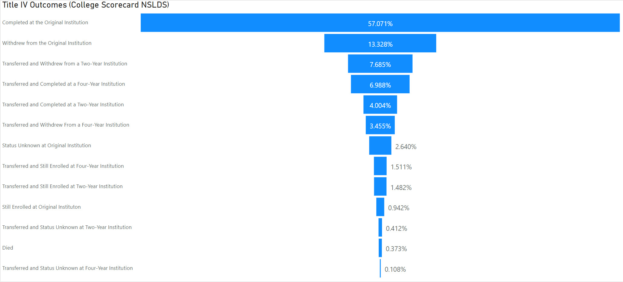
I like to visualize the outcomes as a funnel as shown below. We can then see immediately then the relative performance at different intervals. I also like to sort the funnel in the order of the outcome result. In the example below 57% completed at the original institution.

We have created a free Interactive to allow you to quickly navigate through the Title IV Outcomes for any individual institution utilizing the latest College Scorecard data. You can also select the financial aid categories and the reporting intervals. The Insight for Higher Education Interactive provides further options to break down this data including groups of institutions and comparisons.
About Public Insight
Public Insight transforms the islands of public data into actionable insights with analytic datasets and Microsoft® Power BI to better understand your industry and market. Insight for Higher Education is an easy-to-use executive planning and analysis application for benchmarking higher education institutions across a wide range of topical areas such as enrollment, graduation rates, degrees awarded, and staffing. Sign up to access a free Factbook Interactive or request a 15-day trial to explore how easy it is to navigate through public data.