Leveraging Scatterplots to Analyze the New College Scorecard Data
There has always been a symbiotic relationship between student debt and student earnings. As student debt has creeped up in recent years, there has also been a data gap with post-graduation earnings. The most recent College Scorecard data is a first attempt to provide some tie-in between student debt and student earning by field of study (4-digit CIP) level.
Is the Data Good Enough?
This data is far from perfect. As this Inside Higher Education article concludes, flaws include:
- Earnings are only from the student’s first year.
- The debt is only federal student debt and does not include private loans or loans taken out by parents.
- Many programs are omitted because of privacy due to small enrollment sizes.
- The dates of the samples are not completely aligned.
Nevertheless, it is better than nothing and beggars can’t be choosy. The data is what it is.
Using a Scatterplot Display to Visualize the Data
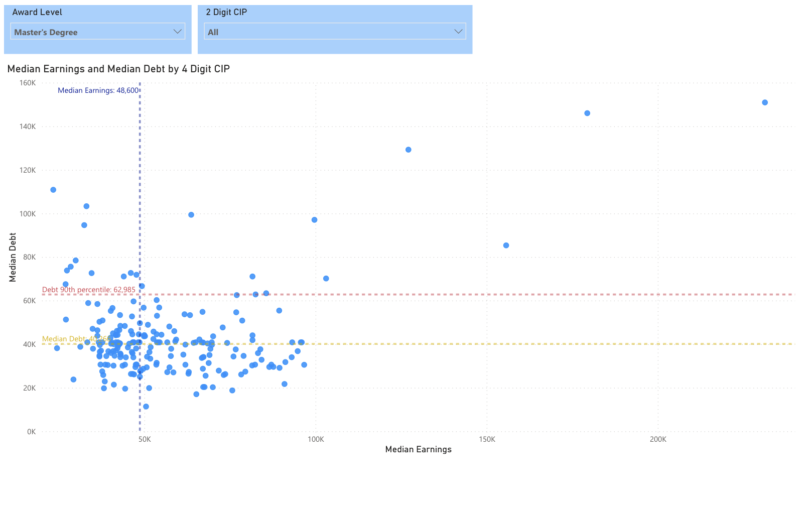
What is the best way to visualize this data? Metrics that are naturally paired lend themselves nicely to a scatterplot analysis. Scatterplots are great because you can work with many different dimensions – x and y axis, size, and color to name four. For this scatterplot, we simply are going to associate median student debt with the Y axis and median student earnings with the X axis. We calculated the median because a simple average could easily distort the results.
The level of detail is also very important. A single program at a single institution could distort the results. We took the data all the way down to its lowest point, which is institution, award level, and 4-digit CIP. You can drill into progressively detail at the institution level using the Power BI drill-down capability. Finally, we added three analytic lines – the median for both earnings and debt and a 90% percentile line on debt. This easily allows you to visualize the outliers, particularly those results with low earnings, high debt (upper left quadrant). The following video illustrates how to use the scatterplot.
Higher Education Data Season is in Full Swing
We are at the start of what I like to call the higher education data season. This is the time of year where new data is constantly being released. We will soon be incorporating the new College Scorecard data into the Insight for Higher Education (IFHE) dataset as well as providing extensive analysis capability in Power BI. In addition, IPEDS has released a slug of new data. Look to your inbox for new product announcements over the coming weeks.
Using the Public Visual
We are pleased to provide a very robust public visual to analyze this data. We provide slicers to select the award level and the 2-digit CIP. The scatterplot shows the individual data points fitting the criteria down to the 4-digit CIP and institutional level and recomputes the analytic lines. We hope you enjoy it!
About Public Insight
Public Insight transforms the islands of public data into actionable insights with analytic datasets and Microsoft® Power BI to better understand your industry and market. Insight for Higher Education is an easy-to-use executive planning and analysis application for benchmarking higher education institutions across a wide range of topical areas such as enrollment, graduation rates, degrees awarded, and staffing. Sign up for a free Factbook Interactive to explore how easy it is to navigate through public data.