How Healthy Are U.S. Hospitals?

If we said that 20% of any industry was at financial risk, we would all be up in arms. However, a recent Morgan Stanley report citing that statistic was met with some degree of yawning. The report cites that 450 hospitals are at risk of closure and another 600 are “weak”. 


With over 90% of hospitals now having reported financials to Centers for Medicare & Medicaid Services (CMS through HCRIS) for 2017, we took at look at the median financial metrics across the industry and are finding some alarming results:

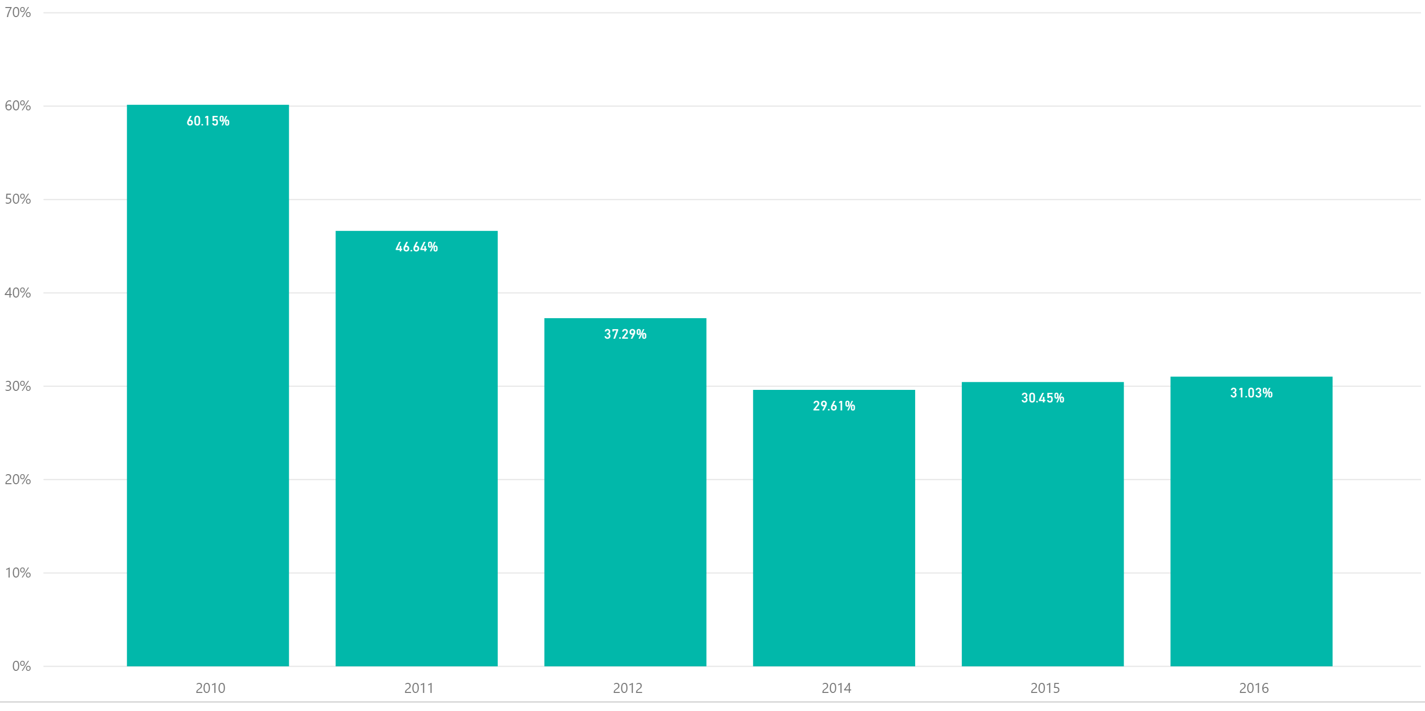
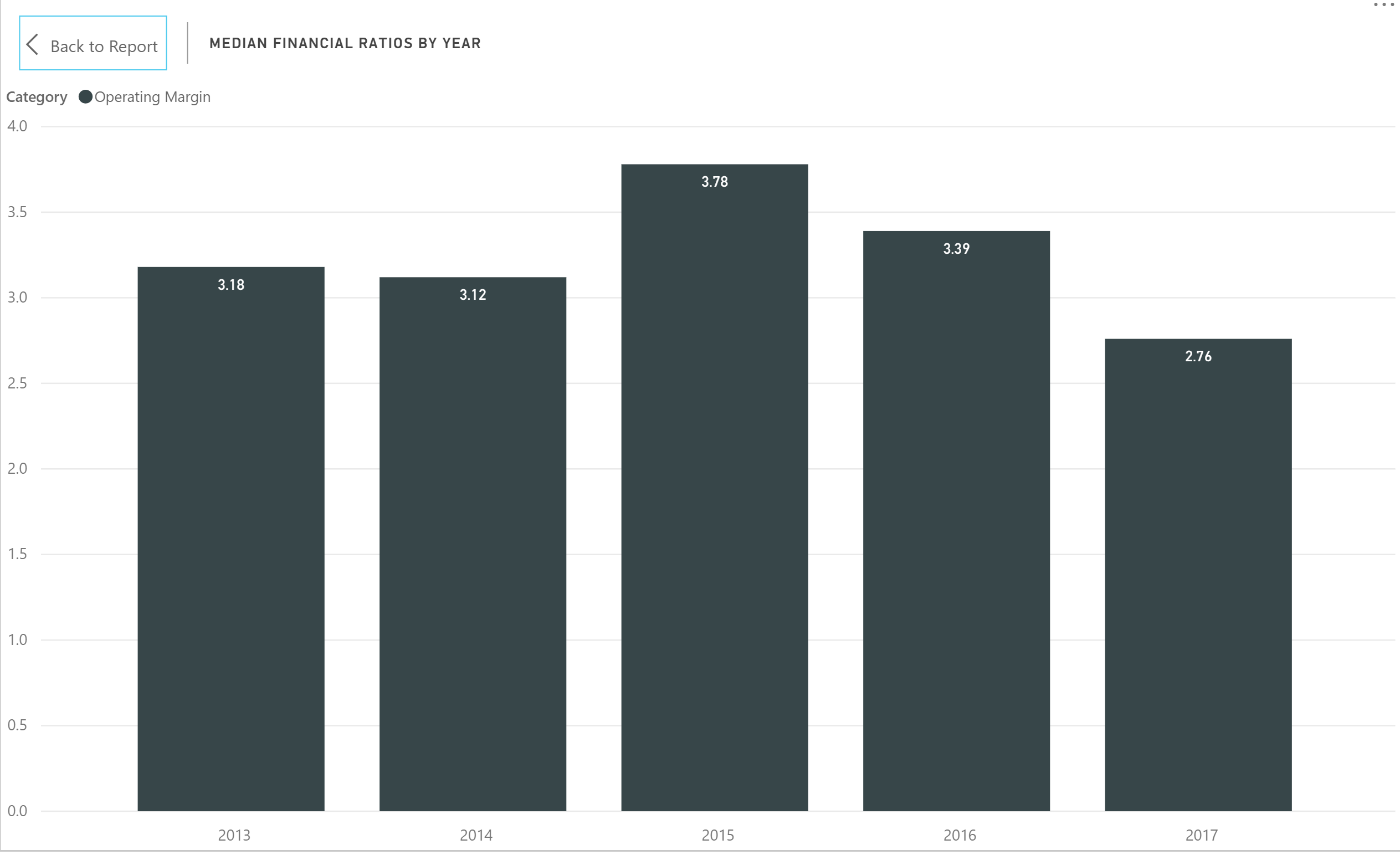
  • Operating margin declined from 3.39% to 2.76%, a five year low (see image below).

  • Days cash on hand has dwindled to 26 days, a decline of 13% since 2013 with days cash on hand from short-term sources declining even further by nearly 30% to just over 10 days.

  • Fixed asset financing is also at a five-year low. One of the benchmarks of the Morgan Stanley report was a lack of capital improvements in the face of a need for increasing capacity.

  • On the positive side, the average payment period continues to decline and is also at a five-year low of 48.4 days.

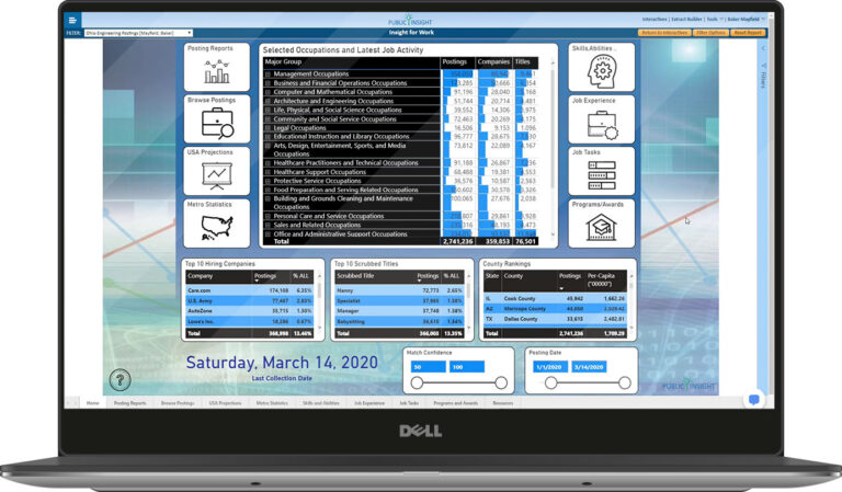
The recently released Insight for Healthcare Interactive provides rapid insights into the healthcare provider ecosystem. The Advanced and Master versions contain financial and utilization metrics for over 7,000 hospitals with filters for geographies and hospital attributes.  


Share This Story

Similar Posts

  • What is the Newly Released Carnegie Data?

    The Carnegie Classification™ has been the major institutional framework for describing higher education institutions since 1970. This classification system comes out approximately every five years with the latest rendition released on February 1, 2016. This release represents the initial data provided by the Indiana University Bloomington Center for Postsecondary Research…

  • Infection Procedures Top Inpatient Volume Growth

    While Medicare inpatient procedure volume has remained flat since 2013, infections are a significant area of high volume change. The treemap below from the Inpatient Procedure Analysis Interactive shows the inpatient volume growth by procedure with color coding by volume change from 2013-2015 using the Medicare Provider and Analysis Review…

  • Regional Variations in Opioid Prescribing Rates

    Given the state of the opioid crisis, any meaningful data is valuable. So when CMS released three years of Opioid Part D prescription data in November, we all rejoiced. CMS also released a mapping tool to analyze the data. While mapping tools can be effective, they can also get in…

  • 12 College Programs with 100+% Growth

    Johnny Nash wrote an award winning song in 1972 called “I Can See Clearly Now”. It was one of those one-hit wonders that still is around today. Johnny would be proud to learn that the field of Vision Science and Physiological Optics topped our findings for emerging program growth with…

  • Where the Vets Live

    As we approach this Memorial Day Weekend, we pause to remember the sacrifice made on our behalf by our veterans. Nationwide veterans comprise 8% of the population. But there are clusters of populations where veterans comprise much higher percentages of the population. This article from Trulia published in Forbes back…

  • What are Five Star Hospitals?

    Consumer ratings are always controversial. You can always ask the wrong question or ask the right question the wrong way. In an attempt to shed transparency on our nation’s healthcare system, the Centers for Medicare and Medicaid Services (CMS) instituted the star ratings system. CMS’ star-rating system is meant to…