CMS Releases 2016 Opioid Prescription Data

This week, CMS released 2016 Opioid Part D Prescribing Rates data which follows on the heels of the original release several months ago. This data release includes Opioid prescriber, claims, and extended release claims at the national, state, county, and zip code level. We have updated our Opioid Prescribing Rates Interactive to include the new data and have drawn some immediate conclusions at a national level:

  • The number of Opioid prescribers as a percentage of overall prescribers has declined from 45.5% to 44.3%. 

  • The Opioid prescription claims as a percentage of all Part D claims has declined to 5.35% from 5.52%, the fourth straight year of decline.

  • Extended release claims continue to migrate up for the fourth straight year from 6.71% to 6.92%. Extended release mitigates the potential risk of opioid overdose.

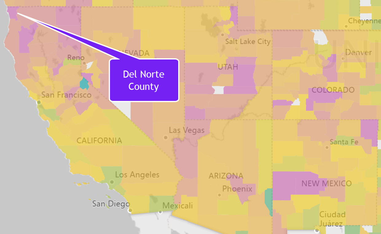
Regionally, there continue to be significant variations in opioid activity. At a state level, Alabama has the highest proportion of Opioid claims to overall claims percentage at 7.47%. While smaller counties may have regional anomalies, there are some major regional differences. For example, counties like Del Norte in northern California have shown a much higher than national average as shown in the map below.  Del Norte has over 2.3x the national average for opioid claims.


The Opioid Prescribing Rate Interactive dynamically analyzes regional opioid claims, extended release claims, and provider data at the national, state, county, and zip code levels. This Interactive is part of our Community Health library and is also available individually for $295. 


Share This Story

Similar Posts

  • The Gender Debt Disparity

    The Huffington Post recently posted a very interesting article on gender debt disparity. The article notes that women hold nearly two-thirds of all student debt – a whopping $833 billion dollars. The article postulates that women also take longer to pay off the debt because they earn less than men….

  • Powerball and Endowment Wealth per Student

    Large dollars tend to attract many of us. That is why the Powerball attracted so many people at the tidy sum of 1.3 billion. Yet the larger the number, the more people participate. Someone had the brilliant idea of distributing Powerball winnings to everyone in the country thinking it would…

  • Student Debt Continues to Rise – Repayments Flat

    Last week, the Government Accountability Offices announced that the federal government will forgive a whopping $108 billion in student loans in the coming years. Prognosticators project a coming economic doom as the student debt crisis approaches mortgage meltdown proportions.   Last week we focused on the earnings of students six…

  • Healthcare Rankings and the Healthiest Cities

    We in the U.S. love our rankings. I think it is embedded in our DNA. As a student of data, I love to see the various rankings and how people get worked up over them. Healthgrades recently released its latest analysis of top quality hospitals and its National Health Index, which…

  • Spring is Here! Which Counties are Physically Active

    I love spring!  As a warm weather person living in the Northeast, I can’t wait to get outside and be physically active. While many are like me, still 29% of the U.S. remains by and large physically inactive and it is very regionally concentrated. The County Health Rankings uses a measure…

  • FAFSA Application Volume Down 11%

    The FAFSA Application Volume declined nearly 11% for the application cycles from June 30, 2014 through June 30, 2017 based on data from Federal Student Aid and analyzed using the Financial Aid Interactive. FAFSA application cycles are based on an 18-month period for any one particular school year.  Note the…