I live in Cleveland, Ohio (home of Lebron James and the Rock ‘N’ Roll Hall of Fame). I would love to believe that our city is having explosive job growth but the real winner according to the latest Occupational Employment Statistics (OES) survey is not Cleveland, Ohio, but Cleveland, Tennessee. Cleveland, TN had 44,770 jobs in 2014 compared to 38,950 and 37,020 jobs in 2013 and 2012 respectively. This is a growth rate of nearly 15% in 2014. Much of this job growth has come in the form of production workers.
The OES survey is a federal-state cooperative program between the Bureau of Labor Statistics (BLS) and State Workforce Agencies (SWAs). The OES program surveys approximately 200,000 establishments per panel (every six months), taking three years to fully collect the sample of 1.2 million establishments. To reduce respondent burden, the collection is on a three-year survey cycle that ensures that establishments are surveyed at most once every three years.
The BLS reports OES data annually on a nationwide basis as well as by state and metropolitan area. This data is broken down by Standard Occupational Classification (SOC) code. There are over 800 detailed classifications within a six digit SOC and the data is rolled up into two-digit major groups. These detailed classifications provide for some interesting fodder for some of these jobs. If you love playing with dynamite, explosive workers have nearly doubled from 2013 to 2014. Slaughterhouse workers have increased 35%.

It is important to note that this data, while reported for the period, does not actually represent the period but a rolling survey cycle. The estimates for occupations in nonfarm establishments are based on OES data collected for the reference months of May and November. The May 2014 OES estimates are benchmarked to the average of the May 2014 and November 2013 reference periods. May 2014 employment and wage estimates are based on all data collected from establishments in the May 2014, November 2013, May 2013, November 2012, May 2012, and November 2011 semiannual samples. Self-employed workers are not included in this survey.
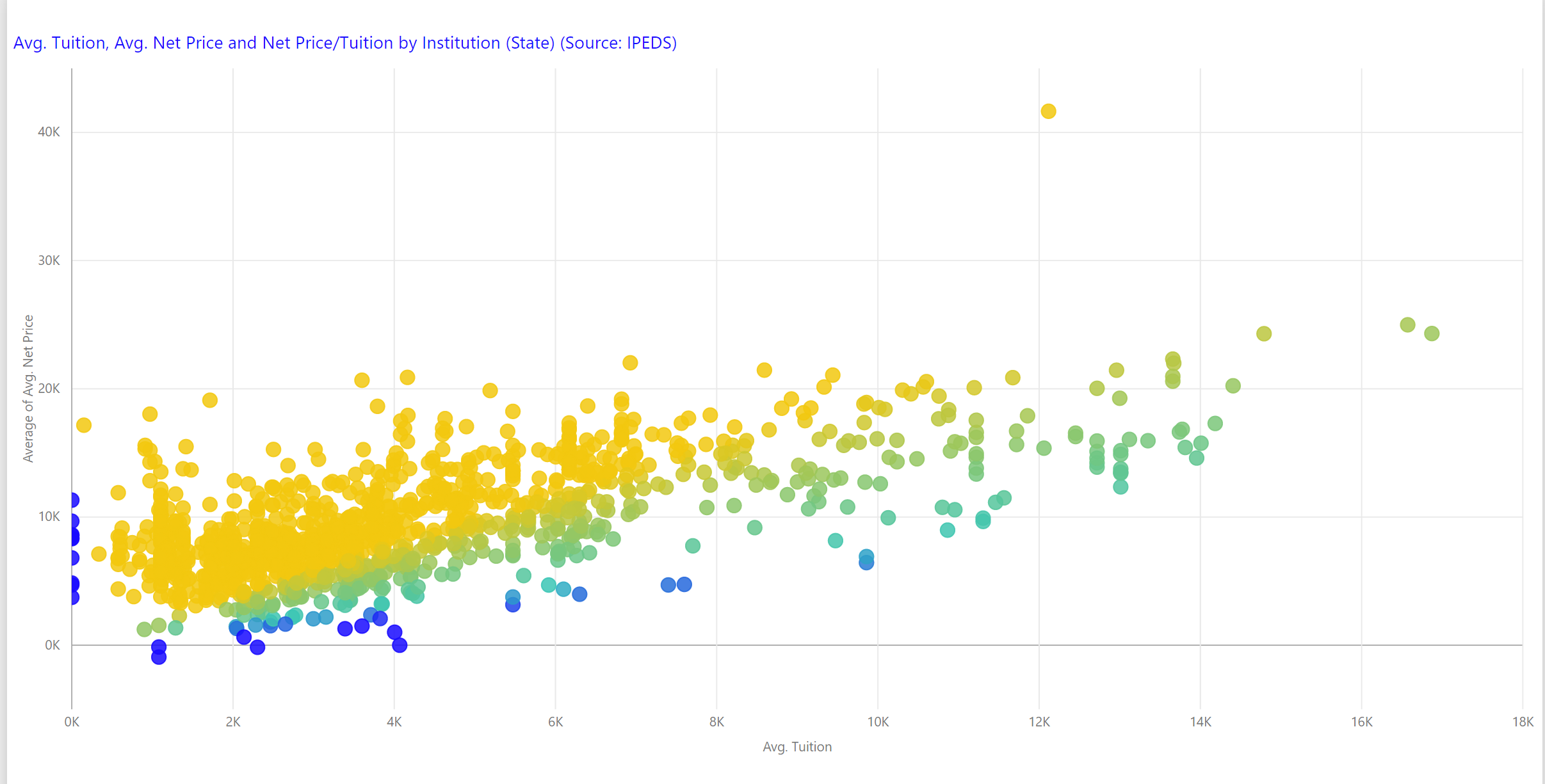
You can browse the OES survey data in Public Insight for free as a registered user by metropolitan statistical area in summary, by two-digit major groupings, and by six-digit detailed classification. We’ve also created a spreadsheet (that you can download by clicking this hyperlink) that provides overall metropolitan job figures and growth rates based on the 2014, 2013, and 2012 Occupational Employment Statistics survey data. We have also provided a summary of jobs and job growth by six digit SOC code for these same reported years. You can browse summary job data by major job category and metro area and we have highlighted those job categories and metro areas with plus or minus 20% growth.