Last week, the Government Accountability Offices announced that the federal government will forgive a whopping $108 billion in student loans in the coming years. Prognosticators project a coming economic doom as the student debt crisis approaches mortgage meltdown proportions.
Last week we focused on the earnings of students six years after attendance. This week, we are going to look at debt levels, the other hot potato from the College Scorecard database. Like earnings, this data is a cross-agency effort that cross-pollinates data from the National Student Loan Data System and the classifications on the FAFSA form.
Median loan debt has risen a hefty 43% from 2010 to 2015 based on an analysis of the College Scorecard data using a weighted average of the cohort sizes. What is probably even more alarming is that the debt continues to tick up post recession with the most recent increase being 7.3%. The median cumulative loan debt is the amount originated at the institution for all student borrowers of federal loans who leave the institution (i.e., either graduate or withdraw) in a fiscal year, measured at the point of separation. Keep in mind that this data is only based on subsidized federal aid activity and does not include unsubsidized loans such as Parent Plus loans. I believe it is an accurate barometer of the debt loads of students today.

The double whammy is that repayment rates have gone down 16.5% since 2010, but have rebounded slightly since 2014 on a weighted average basis. This should be hardly surprising since the earnings are flat. Repayment rate is an interesting metric. This is defined as the fraction of student borrowers who are making at least some progress paying down their loans (i.e., their balance is declining) and are not in default. Thus, if a student has paid one dollar of principal, they would be showing as active payers. The repayment rate is measured at one, three, five, and seven years after entering repayment. For this metric, we used the three year repayment rates.

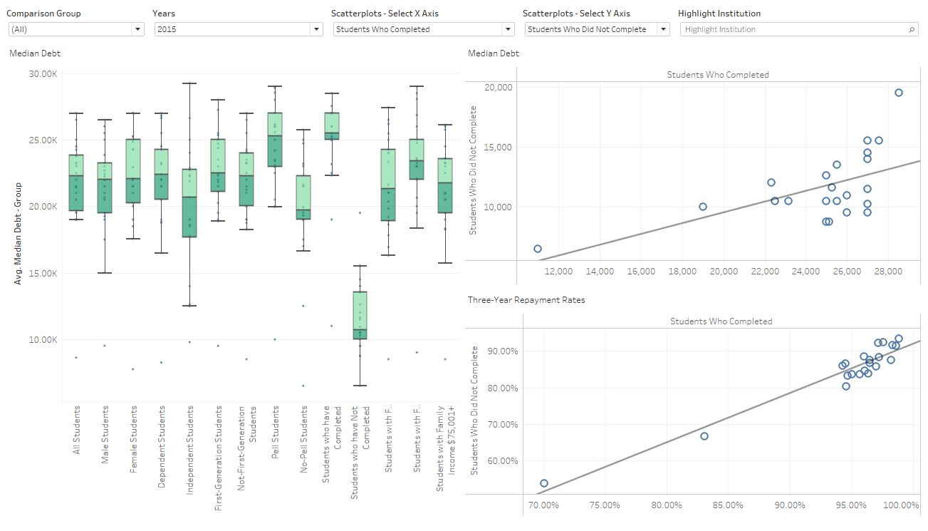
You can analyze this data for an individual institution and FAFSA classifications using the free visualization below. The Student Debt Interactive provides the ability to dice and slice student debt for over 5,000 institutions by multiple categories.

Analyze Student Debt by Institution