Death Rates Rise Sharply for Millenials

The new CDC mortality data continues to paint a rather grim picture. Last week we focused on the external causes of the rise in death rates. This week we analyzed the mortality (death) rate among age groups using over 1.8 billion data points over 17 years from the CDC. You can now analyze this extensive data yourself with no data knowledge using the new Mortality Rate Interactive.  This Interactive is part of the Community Health subscription.


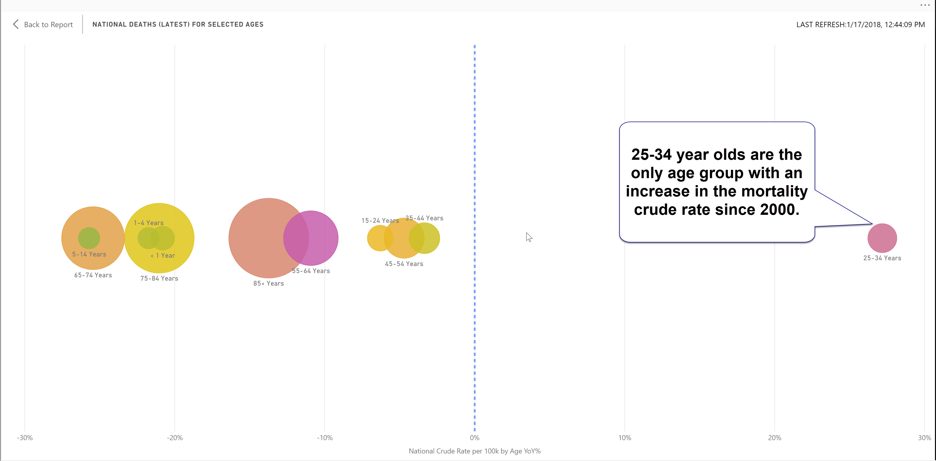
The mortality for every age group has declined from 2000 to 2016. The exception is the 25-34 year olds which is up 27% from 2000. The dot plot graphic below starkly shows this.


The mortality rate has skyrocketed in the past two years among age groups covering ages 15-44. This is a consistent trend that we saw with the external and behavioral causes last week. The counties that have experienced the highest jumps in this age bracket appears to be most concentrated in the MidAtlantic and Northeast. I go into these topics in more depth in the video blog.  


The new CDC mortality data is now available in Public Insight. We have launched an amazing new Interactive based on nearly 2 billion data points and 17 years of mortality data down to the county level. With Interactives, you can explore and analyze this critical data yourself with no data knowledge or experience. We have also created a free Interactive for the specific age related mortality data.

Share This Story

Similar Posts

  • Are Outpatient Imaging Quality Measures Effective?

    CMS began developing measures evaluating imaging efficiency back in 2007. These performance measures have been distributed as part of Hospital Compare for the past four years. Lower percentages suggest more efficient use of medical imaging. The purpose of reporting these measures is to reduce unnecessary exposure to contrast materials and/or…

  • Black Disparities in Premature Death

    County Health Rankings has always used Premature Death as a measure in deriving its ranking formula. Years of Potential Life Lost Before Age 75 (or YPLL) counts as 50% of the Health Outcomes score. Every death occurring before the age of 75 contributes to the total number of years of potential…

  • Hot Growth Industries

    The building boom is officially back after a long hiatus. The number of construction employees increased 5% in 2016 according to the most recent County Business Patterns released by the U.S. Census.  The sector however with the most number of new establishments is the Information sector (NAICS 51) which increased 5%….

  • Will Voter Unpredictability Continue in 2018?

    Much has been written about the increased polarization of America and its collective impact on communities. There were many surprises in the 2016 election and people are bracing for a potentially tumultuous 2018 mid-term election. Ohio, where I live, is one of the swing states. The average county in Ohio…

  • Inpatient vs. Outpatient – What the Numbers Show

    Analysts in health care don’t agree in unanimity very often, but most seem to agree that there will continue to be a quantum shift in healthcare from inpatient to outpatient. In this two part series, we will attempt to quantify and support this important trend. We utilized the Beds and…