EVICTED – The Impact of Housing Affordability

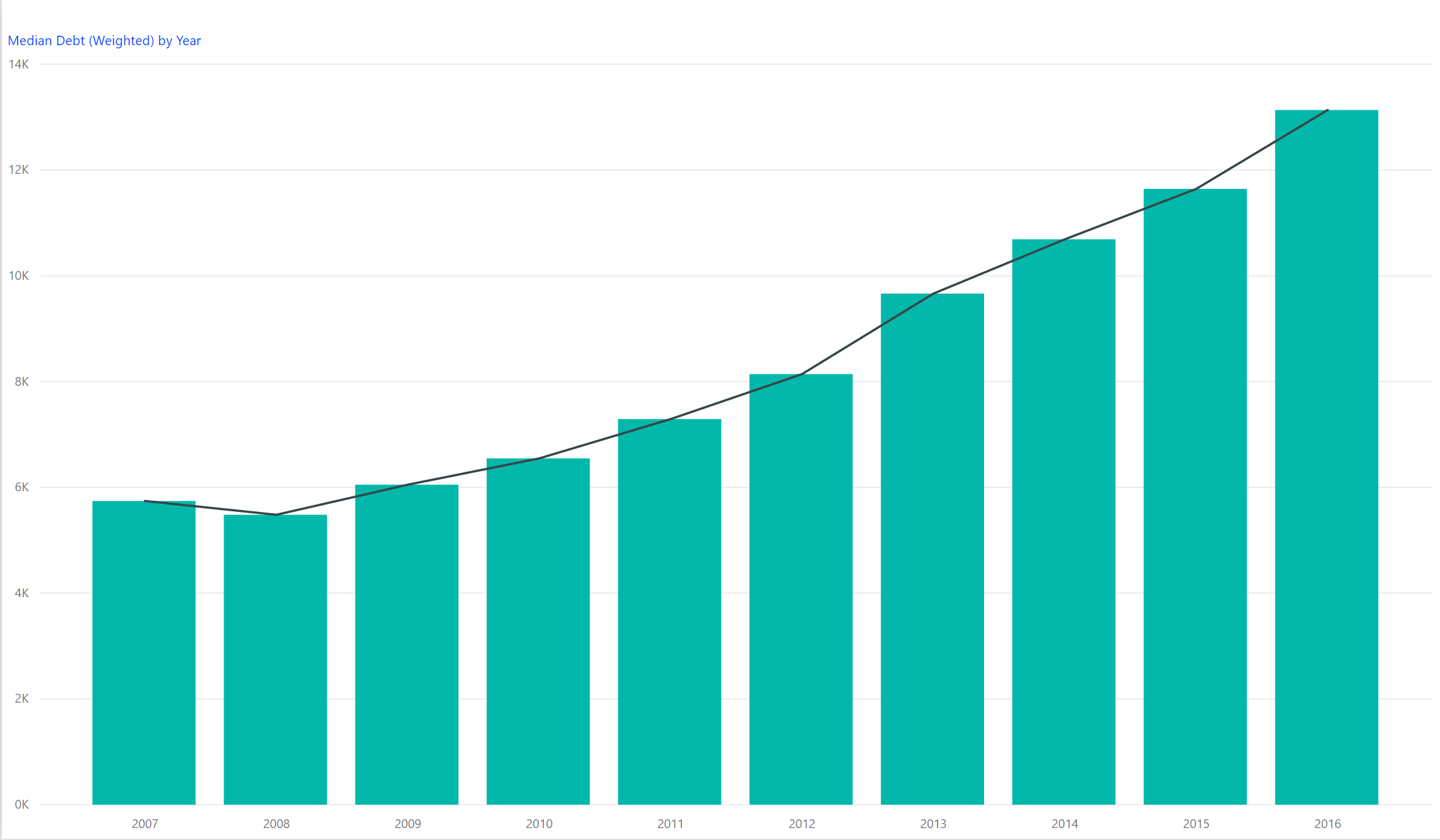
I was in the Bay Area this week for a health technology conference at Stanford University. I took Lyft back and forth from where I was staying. While conversing with one driver in my rudimentary Spanish, I found out that his family was spending $3,000 a month for a two bedroom, one bath home. He was working 16 hour days just to plow a large part of that income towards their rent. I am reading the book Evicted which describes the plight of inner city families to stay in one place. The downstream impact on our urban social infrastructure is staggering.


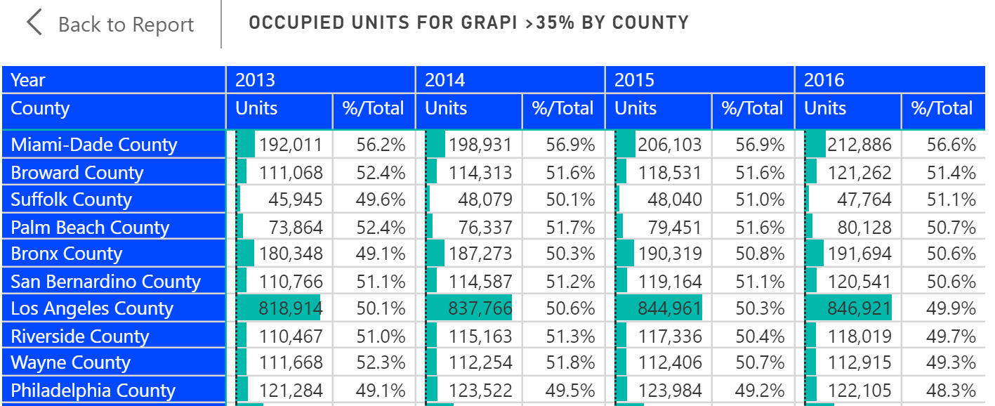
The American Community Survey collects a statistic on the number of housing units where the occupants spend more than 35% of income on rent. It is GRAPI or Gross Rents as a Percentage of Income. Nationwide, 42% of housing units spent more than 35% on rents, but in counties where the population is greater than 1 million residents, that number can cross 50%. The top ten counties for GRAPI with populations above 1 million residents are shown below. It is unfortunate that the ACS survey ends with a band at 35% because it would not be surprising to me to see homes where 70% or more of income goes towards housing.


We have curated housing data from the American Community Survey into 25 indicators as part of the Population Analysis Interactive including GRAPI. Here at Public Insight, we love to put data to work into creating useful insights. We believe that the power of curated data and business intelligence is extraordinary. We’d love to hear from you and be of help to you and your organization.  

Share This Story

Similar Posts

  • Top 10 Projected Occupations in 2026

    Healthcare workers dominate the top 10 list for projected job growth. Nine of the top 10 jobs are projected to have greater than 30% growth over the coming 10 years. Using the new Degree-to-Jobs Interactive, we sorted the projections table by projected growth and isolated the top 10 jobs as shown…

  • Has Distance Education Hit Its Peak?

    Programs offered through distance education or what we might conventionally refer to as online programs actually declined as a percentage of all programs from 10.8% to 10.5% in 2017 and 2016 respectively. This was the first time that distance education has actually declined since this data started being collected by…

  • Student Debt Rises 13%

    The newest College Scorecard data released several weeks ago reveals an ongoing trend in student debt. The median student debt increased 13.1% from 2015 to 2016. The median student debt has now more than doubled since 2007 as shown by the following graph. We calculated this using a weighted average…

  • Is Bureau of Labor Statistics Data Adequate?

    Several weeks ago, the Bureau of Labor Statistics (BLS) released updated Occupational Employment Statistics (OES) survey data. BLS OES is one of those foundational programs and datasets that are used for comprehensive occupational analysis. It produces employment and wage compensation estimates annually for nearly 800 occupations. These estimates are available…

  • A Look at the New Education Outcome Measures Data

    The new IPEDS Outcome Measures (OM) survey is the first stab at going outside of the traditional first-time, full-time reporting. We took a birds-eye view of this data across the landscape of reporting institutions using a new Graduation Rates Interactive.  A total of 3,838 institutions reported data under the OM…

  • Hot Jobs, Growing Wages, and Weird Titles

    I love looking at the Bureau of Labor Statistics Occupational Employment Statistics data. This data produces employment and wage estimates annually for over 800 occupations and estimates for states and metropolitan areas. I especially enjoy looking at this data from both a job growth and a wage growth perspective. That…