When is Free Tuition Really Free?

The sticker pricing game has been in place a long time. No one ever pays full sticker price for items such as jewelry or cars. That is probably why University of Michigan came under scrutiny for its free tuition guarantee for families with income under $65,000. Cynics pointed this out as simply marketing hype.


It is hard to single out one line item like tuition in the overall costs of attendance. After all, costs of attendance are tuition plus expenses less grant and scholarship aid. Free tuition could be merely moving dollars from the discount bucket (i.e. aid) to the gross bucket (i.e tuition). Postsecondary institutions have longed been required to disclose net price and provide a pricing calculator on their web site.


The new Public Insight Tuition and Pricing Interactive is designed to analyze the components of net price for the entire landscape of postsecondary institutions. Fees such as books and supplies, and room and board can range very widely.

  • On-campus expenses for University of Michigan are $13,956 compared to the average annual tuition of $14,401 for in-state students.

  • The average scholarship and grant aid for all students is $11,109.

  • However, the average for students with family income of less than $75,000 is $20,271.

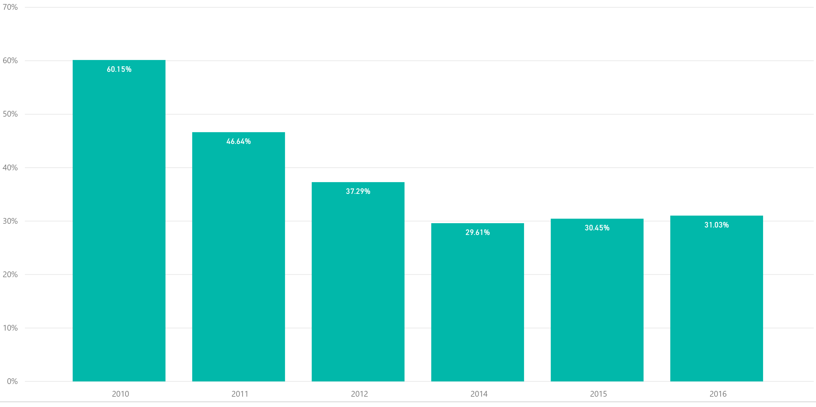
So the grant and scholarship aid is actually greater than average annual tuition. In fact, tuition is becoming far less of an issue when factoring in the costs of education. In-state institutions such as Michigan have provided nearly 6.3 billion in total scholarships and aid for the year ended August, 2015 a jump of 6.4% in the past two years. Tuition during the past two years have been relatively flat during the period. 


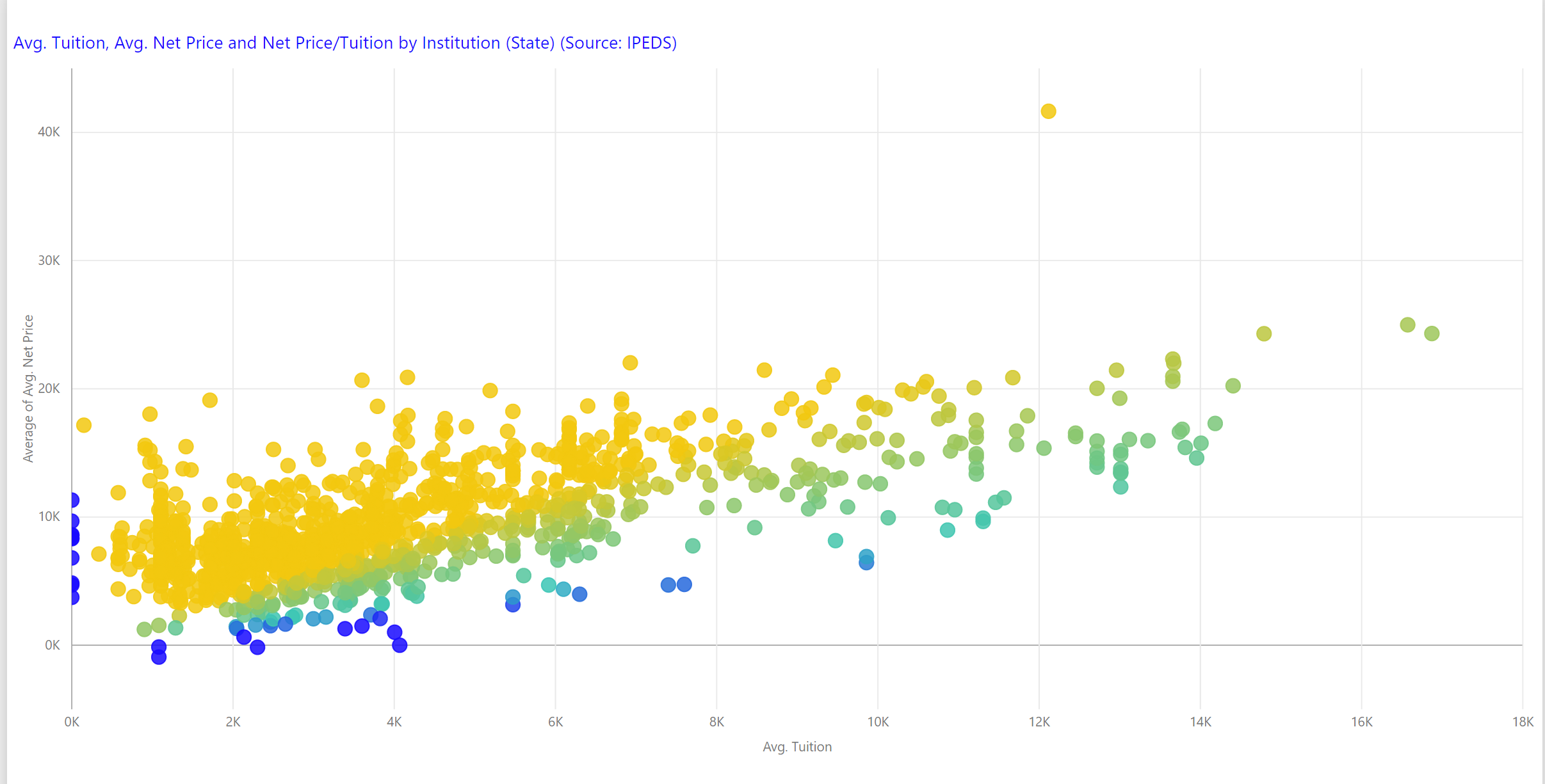
The scatterplot below shows state institutions net price against tuition. The institutions in gold have a higher net price than tuition meaning the costs of expenses exceed the scholarship and grant aid. While free tuition may be a matter of moving money around, it also could usher in a world of more transparency around the actual costs of attendance.


Share This Story

Similar Posts

  • On Faculty Compensation and Gender Disparity

    It will take many years for the faculty gender pay gap to close at the current rate of change. From 2014 to 2015, women received around half a percent higher pay increase from men over the various institutional sectors. There is still a 16% and 14% gender pay gap for full professors…

  • Student Debt Continues to Rise – Repayments Flat

    Last week, the Government Accountability Offices announced that the federal government will forgive a whopping $108 billion in student loans in the coming years. Prognosticators project a coming economic doom as the student debt crisis approaches mortgage meltdown proportions.   Last week we focused on the earnings of students six…

  • Infection Rates and the Long-Term View

    My Cleveland Indians have now won 13 games in a row. That along with their overall record and stellar play over the entire season tells me they are a good team. However, at any given point the Indians or any particular player could play really poorly. The similar challenge with…

  • Inpatient vs. Outpatient – What the Numbers Show

    Analysts in health care don’t agree in unanimity very often, but most seem to agree that there will continue to be a quantum shift in healthcare from inpatient to outpatient. In this two part series, we will attempt to quantify and support this important trend. We utilized the Beds and…

  • Have Student Debt Repayment Rates Bottomed?

    Student repayment rates continues to decline, although the trend seems to be slowing, according to the most recent College Scorecard data. This data measures repayment rates at 1,3,5, and 7 years. Repayment rates and default rates are very different. Repayment rates are the percentage of students who have made progress…

  • Infection Procedures Top Inpatient Volume Growth

    While Medicare inpatient procedure volume has remained flat since 2013, infections are a significant area of high volume change. The treemap below from the Inpatient Procedure Analysis Interactive shows the inpatient volume growth by procedure with color coding by volume change from 2013-2015 using the Medicare Provider and Analysis Review…