The most recent batch of Hospital Compare data has expanded the whole area of readmissions, returns, and deaths. There are now separate measures for mortality rates, readmissions, and hospital returns. The hospital returns measure is brand new, with the most recent data through June 2016, and applies to heart attack and heart failure patients. We examined this data using the updated Quality Ratings Interactive scheduled to be released next week.
Hospital returns are defined as the number of days the patient spent back in the hospital (in the emergency department, under observation, or in an inpatient unit) within 30 days after they were first treated and released. The measures compare each hospital’s return days to results from an average hospital with similar patients to determine if this hospital has more, similar, or fewer days than average. The data is compiled using Medicare claims data and eligibility data.
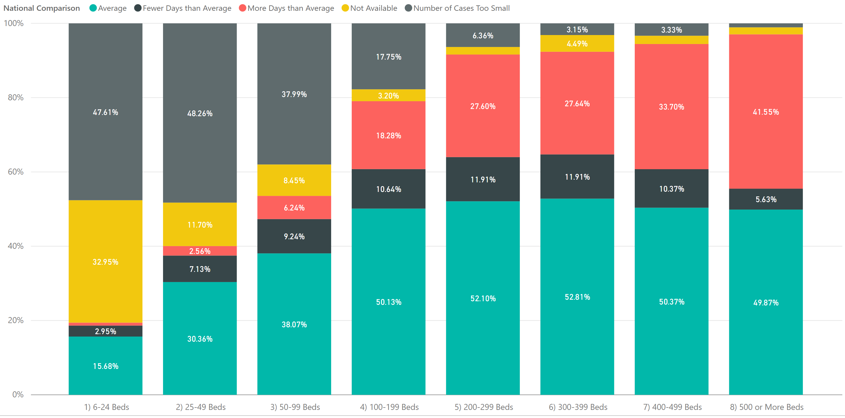
I highlight the word average because what is average? We analyzed hospitals across various categories from size to location to specialty. Starting with bed size, it is clear from the graph below that hospital returns ratings are negatively weighted towards larger hospitals. The red color indicates hospitals with above average returns and the graph is sorted by bed sizes.

This 100% column graph shows the proportionate number of hospitals with return days at the national average, above the national average and below the national average by categories of bed size. Clearly, the graph shows that the larger the hospital, the more likely they are to have above average returns. It is also apparent that the smaller hospitals are increasingly likely to have a volume simply too small to measure. Thus, the pool of available data creates an inefficient comparison.