Healthcare Rankings and the Healthiest Cities

We in the U.S. love our rankings. I think it is embedded in our DNA. As a student of data, I love to see the various rankings and how people get worked up over them. Healthgrades recently released its latest analysis of top quality hospitals and its National Health Index, which listed the 25 healthiest U.S. cities. In the Healthgrades Report to the Nation, it spotlighted Denver as getting health care right. As with any rankings, it comes down to the measures. Healthgrades uses four key indicators in their evaluation.

  • Access to Care

  • Access to Quality Hospitals

  • Population Health

  • Risky Behaviors

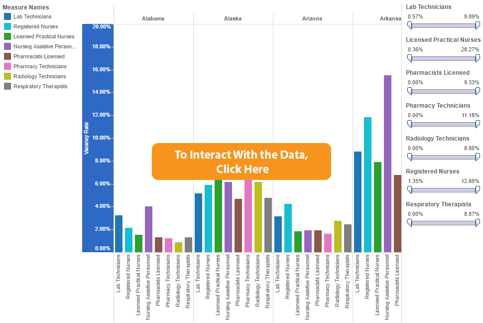
Many rankings use a number of measures based on the Behavioral Risk Surveillance System (BRFSS). At Public Insight, we have ingested this data into our platform by state, county (which is fairly dated), and metropolitan statistical area. We also have the CDC 500 (or 500 Cities Project) which uses sampling to weight the criteria against cities. You can browse this data for free in our Data Browser tool. Stay on the lookout for many new things coming your way for community health analysis. 


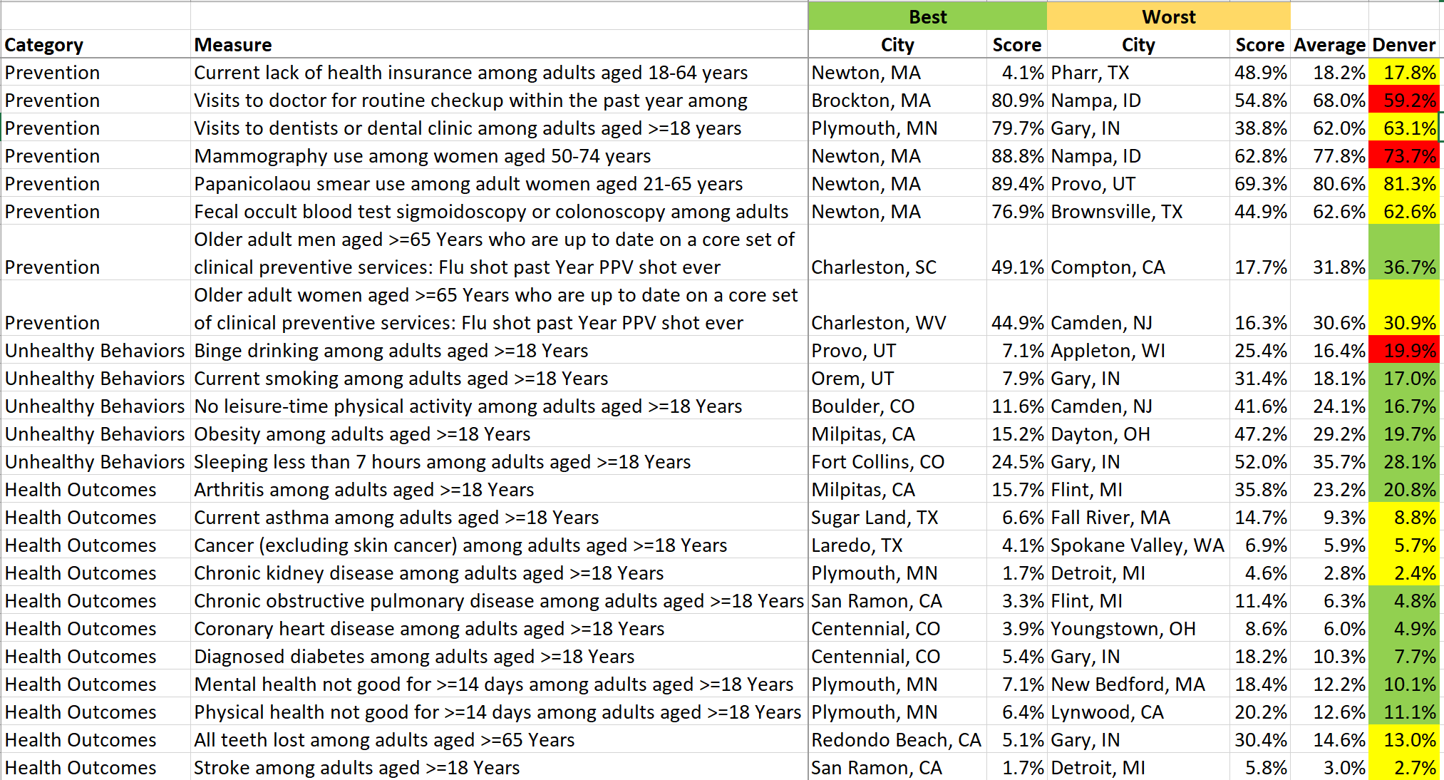
In looking at the health of cities, there is no perfect city. We used the CDC 500 to highlight the best and worst cities by category.  We also used Denver as our comparison city. As noted in the table below, Denver does well in most categories, but clearly drinking is an issue. Apparently our friends in the Mile High City also don’t like to visit the doctor routinely because they fare worse in that area. 


Share This Story

Similar Posts

  • College Building Boom Approaches $1 Trillion

    Postsecondary institutions continue to invest heavily in capital assets and the cumulative investment across public and private institutions has crossed $900 billion, an increase of 27% over a five-year period. The capital investment growth rates are almost identical for both public institutions and private non-profit institutions as noted in the…

  • Black Disparities in Premature Death

    County Health Rankings has always used Premature Death as a measure in deriving its ranking formula. Years of Potential Life Lost Before Age 75 (or YPLL) counts as 50% of the Health Outcomes score. Every death occurring before the age of 75 contributes to the total number of years of potential…

  • Student Financial Aid up 6.2%

    Postsecondary institutions gave over $17 billion in financial aid in 2015. This represented a 3% increase from 2014. However, the number of student receiving the financial aid declined 3% so the average financial aid per student when looked at over the entire postsecondary landscape actually increased 6%. We used data…

  • Income Inequality Marches On

    Welcome to 2018!  We are making some fundamental shifts to our Weekly Insights which I hope you will enjoy.  We are moving our content towards more video and free self-service analysis around our weekly topical theme. We welcome your feedback and your ideas.    Over 70% of population health is…

  • Distance Education Programs Growth Up 18%

    After a few weeks break, we are back with this week’s edition of the Insight for Education blog. In my previous blog on distance enrollment, we cited that distance enrollment exclusive growth was up nearly 15% and more and more schools were offering distance education. In this analysis we wanted…

  • March 2020 Job Postings Signals Seismic Labor Shifts

    New Labor Market Analysis Application Released by Public Insight The COVID-19 reality is starting to reflect itself in the labor market. Volatility in the labor market will be the new normal for the foreseeable future. We analyzed and coded over 2 million active job postings as of past Saturday, March…