County Health Rankings has always used Premature Death as a measure in deriving its ranking formula. Years of Potential Life Lost Before Age 75 (or YPLL) counts as 50% of the Health Outcomes score. Every death occurring before the age of 75 contributes to the total number of years of potential life lost. For example, a person dying at age 25 contributes 50 years of life lost, whereas a person who dies at age 65 contributes 10 years of life lost to a county’s YPLL. The YPLL measure is presented as a rate per 100,000 population and is age-adjusted to the 2000 US population.
The 2018 County Health Rankings has disaggregated this measure to Black and Hispanic populations. On average, U.S. counties have a YPLL of 8,194. Whites have a YPLL of 8,206 or right around the overall average. The Black or African American YPLL on average is 10,688 or 30% higher than the white population. Interestingly, the Hispanic YPLL is on average 6,162, or 25% less that the white population. This phenomena has been studied by a number of researchers. The YPLL measure is part of the County Health Rankings Interactive. You can now purchase these Interactives individually or as part of the Community Health Library.
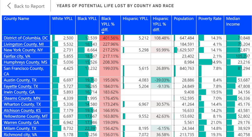
Regionally, YPLL is literally all over the map. The Black YPLL in Washington, D.C. is 4x higher than white and dwarfs the next highest county as shown in the following table. While the Black/White YPLL disparities do seem more likely in urban areas, it is not always absolute as noted by the county population and poverty rate. Clayton County, GA for example has a Black YPLL of 7,723 compared to White YPLL of 12,525 or Black/White YPLL of -38.4%. Clayton County is urban (near Atlanta), has a 68% black population and a 21% poverty rate.

We have created a free Interactive which you can use to interact with this data which I have found to be fascinating. The table can be sorted by any of the columns and you can filter on any state. Keep in mind that this data is not available for all counties.