Is There an Oasis in the New Food Data?

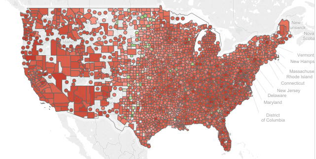
The recently released updated Food Environment Atlas data by the USDA give us a real glimpse into the progress that we as a nation are making on combating food deserts. The USDA defines food deserts as lack of access to a healthy food retail outlet (a supermarket or large grocery store) within 1 mile, or 10 miles in rural areas. The last date for measuring this data was 2010 and the latest data now available is 2015. So with the hindsight of 5 years, we can now see how we are doing. 

  • Overall, the percentage of people with low access to healthy foods has declined from 20.52% to 18.78%

  • Children, a particularly hot topic in discussions of food deserts, have also improved from 5.05% to 4.68%. 

The problem, however is that the number of low-income households with limited access to healthy foods has barely changed with 5.65% having low access in 2010 and 5.68% in 2015.  A case study could be made of supermarkets that come in and out of the inner city such as this one in my home city of Cleveland. In fact, households with no car and low access to healthy foods actually increased from 1.76% in 2010 to 1.81% in 2015 according to this data.


The new USDA Food Environment Atlas data is now available in the Public Insight Data Catalog. Registered users can browse this data by county for both 2010 and 2015 using our free Data Browser tool.  Food Environment Atlas is one of a growing number of community based data sources available in Public Insight.
 

Share This Story

Similar Posts

  • March Madness and the Top Line

    Everyone has caught March Madness fever. The first two rounds of this landmark tournament sparked more double digit seed upsets than any other year. Yet as we sit here for the sweet 16, all of the number one seeds advanced. It is no surprise to anyone either that NCAA basketball…

  • COVID-19 Dashboard with NYT Data

    Analyze COVID-19 Cases by National, State and County Level It is important for today’s business leaders to consider the impact of COVID-19 when making decisions and allocating resources. The accuracy of COVID-19 data reported by news sources and online publications goes beyond the numbers themselves, the interpretation of the statistics…

  • International Student Enrollment Visualized

    In last week’s blog, we talked about out of state enrollment and its potential impact on both the diversity and finances of the university. International enrollment is even considered a bigger potential bonanza to colleges and universities as many international students pay full tuition. According to the Institute of International…

  • Spring is Here! Which Counties are Physically Active

    I love spring!  As a warm weather person living in the Northeast, I can’t wait to get outside and be physically active. While many are like me, still 29% of the U.S. remains by and large physically inactive and it is very regionally concentrated. The County Health Rankings uses a measure…

  • Powerball and Endowment Wealth per Student

    Large dollars tend to attract many of us. That is why the Powerball attracted so many people at the tidy sum of 1.3 billion. Yet the larger the number, the more people participate. Someone had the brilliant idea of distributing Powerball winnings to everyone in the country thinking it would…

  • Nursing Home Coverage of the Elderly

    While long-term care services more than the elderly, approximately 63% of residents are 65 or older. According to the Administration on Aging, population 65 years or older will increase from 14.1% of the population to 21.7% of the population by 2040. As the population ages over the course of the…