What do Sierra Vista and Hinesville Have in Common?

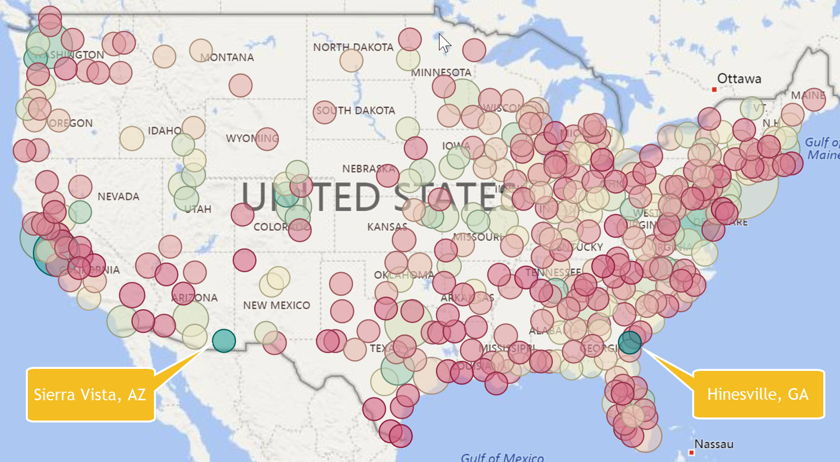
Sierra Vista, AZ and Hinesville, GA probably don’t seem to have much in common. One is in eastern Arizona and the other is in southeast Georgia. They are both very small cities with populations of around 40,000. What they have in common is a market concentration for computer occupations with a location quotient of around four times the national average. These two markets pop out when you show a map of metropolitan areas color coded for location quotient as shown below. Markets with a high saturation for computer occupations are a cyan color while those with lower saturation are in red.


Location quotient reveals market concentration because it compares the local region (metro area in this case) to the nation. The size of the points in the map above is the absolute number of jobs (computer occupations in this case). A market like Chicago has a high number of computer jobs but it is not concentrated compared to the nation. In other words, it has the expected number of computer jobs compared to all other occupations for that size market. 


We have updated the popular Degree-to-Jobs Interactive to include the latest data from the Occupational Employment Statistics survey for 2017. This Interactive includes job and wage analysis by market for over 800 job occupations with crosswalks to CIP codes for program planning and analysis. This update is automatically available to our subscribers. You can purchase this as an individual Interactive for $295 or as part of the Higher Education Institution library


Share This Story

Similar Posts

  • Is There an Oasis in the New Food Data?

    The recently released updated Food Environment Atlas data by the USDA give us a real glimpse into the progress that we as a nation are making on combating food deserts. The USDA defines food deserts as lack of access to a healthy food retail outlet (a supermarket or large grocery store)…

  • Students Moving Back on Campus

    The number of students living on-campus for the approximately 4,500 non-state institutions has increased from just over 43% in 2011 to nearly 53% just four years later in 2015. The pie graph below shows the movement from 2011 to 2015 with the yellow slice indicating the percentage of students living…

  • Self-Funded Research Remains the Trend in Higher Education

    Research and development expenditures continued their flat growth since 2011 according to the most recent data from the National Science Foundation Higher Education Research and Development Survey (HERD). Research expenditures increased 1.66% for all reporting institutions from 2013 to 2014 and have increased cumulatively only 4.76% since 2011.  The primary…

  • A Look at the New Education Outcome Measures Data

    The new IPEDS Outcome Measures (OM) survey is the first stab at going outside of the traditional first-time, full-time reporting. We took a birds-eye view of this data across the landscape of reporting institutions using a new Graduation Rates Interactive.  A total of 3,838 institutions reported data under the OM…

  • Private Room Average Hospital Stays up 10%

    While average length of stay has experienced a long-term decline, one component of average stay seems to be increasing – private rooms. The average stay in a private room increased nearly 10% based on an analysis of the 2016 Medicare Provider Analysis and Review (MedPAR) data set.    Even more…

  • FAFSA Application Volume Down 11%

    The FAFSA Application Volume declined nearly 11% for the application cycles from June 30, 2014 through June 30, 2017 based on data from Federal Student Aid and analyzed using the Financial Aid Interactive. FAFSA application cycles are based on an 18-month period for any one particular school year.  Note the…