Are Outpatient Imaging Quality Measures Effective?

CMS began developing measures evaluating imaging efficiency back in 2007. These performance measures have been distributed as part of Hospital Compare for the past four years. Lower percentages suggest more efficient use of medical imaging. The purpose of reporting these measures is to reduce unnecessary exposure to contrast materials and/or radiation, to ensure adherence to evidence-based medicine and practice guidelines, and to prevent wasteful use of Medicare resources. We looked at this data using the Quality Ratings Interactive which analyzes all of the quality ratings measures from CMS.

  • Overall, imaging performance across the six measures has declined over the past four years or remained flat (MRI for lower back pain has not changed much).

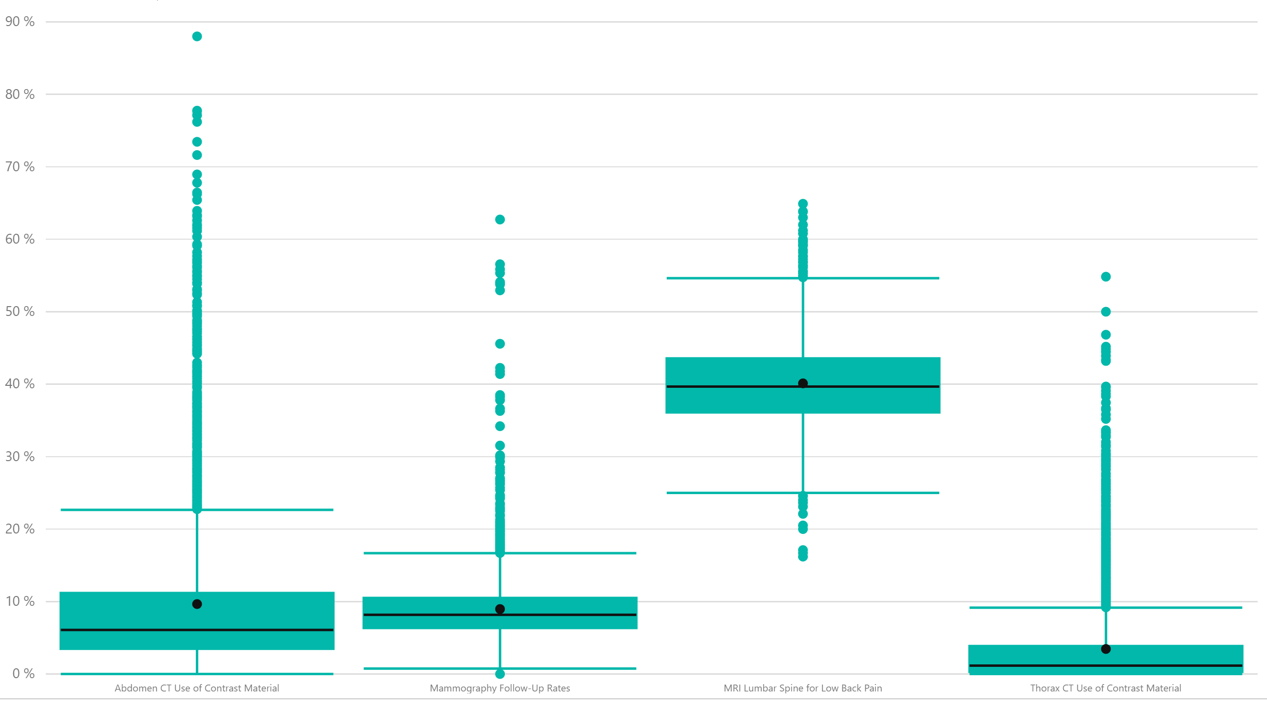
  • However, there is incredible variability among hospitals across all of the imaging measures as shown in the box and whiskers plot below. 

We picked four of the measures to illustrate. The line indicates the median of the performance rate with the inner and outer lines representing the inner two quartiles. Anything outside of that is an outlier. We can see that the number of outliers covers a very wide range of results and even within the inner quartiles, there is a pretty wide range of results (see MRI of the back in particular). Further, the variability has not changed a whole lot over the trailing four years. 


The Lewin Group was contracted by CMS to perform an assessment on these performance rates and they make some interesting observations in their research. You can find these studies on the QualityNet site.


Share This Story

Similar Posts

  • New Data Highlights Student Loan Repayment Rates

    According to the Institute for College Access and Success, seven in 10 seniors (69%) who graduated from public and nonprofit colleges in 2014 had student loan debt, with an average of $28,950 per borrower. Over the last decade—from 2004 to 2014—the share of graduates with debt rose modestly (from 65%…

  • The 13 College Scorecard Title IV Outcomes

    Where Students Go Based on the Latest College Scorecard Data In our last post, we provided some insight into the IPEDS Outcome Measures data. The IPEDS Outcome Measures data was designed as a supplement to graduation rate data which has always been questioned as an effective measure for measuring student…

  • Income Inequality Marches On

    Welcome to 2018!  We are making some fundamental shifts to our Weekly Insights which I hope you will enjoy.  We are moving our content towards more video and free self-service analysis around our weekly topical theme. We welcome your feedback and your ideas.    Over 70% of population health is…

  • STEM Enrollment Fields Show Strong Growth

    The IPEDS Enrollment by Major Fields of Study is collected every other year and 2016 is a new reported year. IPEDS collects nine major fields of study and the enrollment is disaggregated by attendance status (full-time, part-time), level (undergraduate, graduate), race, and gender.   There are numerous ways to breakdown…

  • The States That Send Students Elsewhere

    IPEDS reports residency numbers for first-time undergraduates by state. This data can be challenging to work with from several perspectives. It is not collected every year by every institution and it does not summarize the students coming from out of the state of the institution.     The Enrollment Suite…

  • March Madness and the Top Line

    Everyone has caught March Madness fever. The first two rounds of this landmark tournament sparked more double digit seed upsets than any other year. Yet as we sit here for the sweet 16, all of the number one seeds advanced. It is no surprise to anyone either that NCAA basketball…