Self-Funded Research Remains the Trend in Higher Education

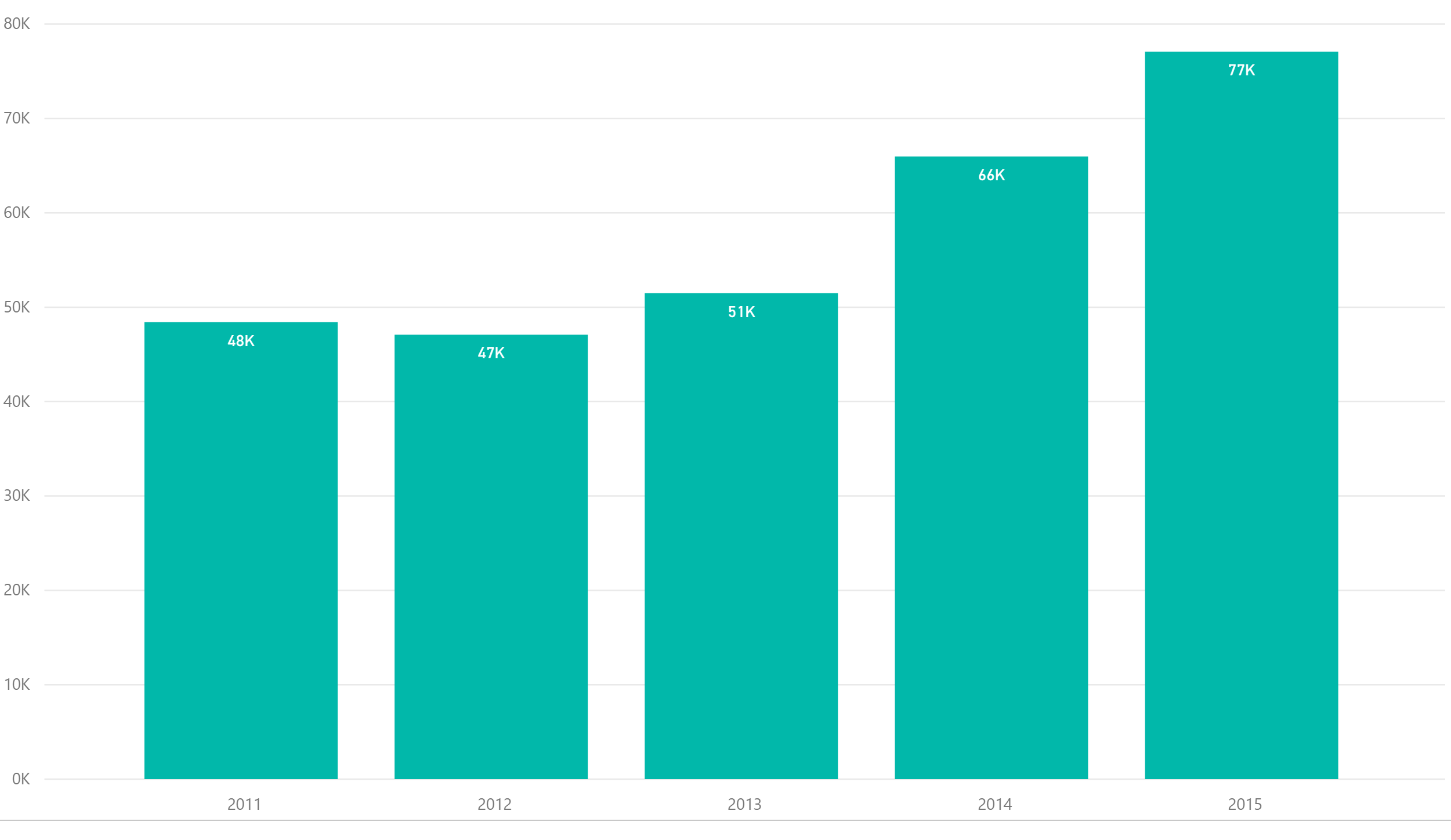
Research and development expenditures continued their flat growth since 2011 according to the most recent data from the National Science Foundation Higher Education Research and Development Survey (HERD). Research expenditures increased 1.66% for all reporting institutions from 2013 to 2014 and have increased cumulatively only 4.76% since 2011.

 
The primary source of funding, federal expenditures, has declined nearly 6% since 2011. In addition, state and local and nonprofit funding have also remained flat during that same period. To make matters even worse for institutions, The American Recovery and Reinvestment Act of 2009 (ARRA) lapsed in fiscal 2014. Institutions received nearly $11 billion in stimulus dollars under this program since 2010. Institutions have made up the difference through self-funded initiatives. Institutional funding now represents 23.60% of all research spending compared to 19.26% in 2011.


We have summarized research expenditures by institution going back to 2003. Johns Hopkins remains the leader in research expenditures with over $21 billion dollars since 2003, nearly 69% higher than the nearest rival, The University of Michigan. The top 25 institutions represent 35% of all of the research expenditures since 2003.

 
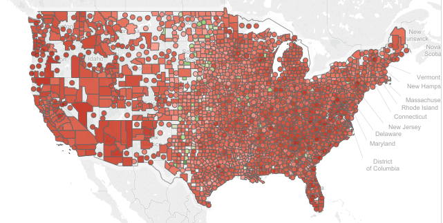
National Science Foundation data is available for free by institution in Public Insight. You can also download the complete list of expenditures by institution by year and source by clicking HERE. We have also provided a treemap showing visually the breakdown of 2014 data by institution. 
 

Share This Story

Similar Posts

  • Outpatient Medicare Hospital Costs up 13%

    The 2016 outpatient procedure data shows overall hospital volume up 11% from 2015. Using data from the Outpatient Procedure Analysis Interactive, we also found that the volume times the average full cost (weighted average cost) on a procedure basis has increased 13.3%. We ran the numbers several ways – first…

  • Regional Variations in Opioid Prescribing Rates

    Given the state of the opioid crisis, any meaningful data is valuable. So when CMS released three years of Opioid Part D prescription data in November, we all rejoiced. CMS also released a mapping tool to analyze the data. While mapping tools can be effective, they can also get in…

  • International Student Enrollment Visualized

    In last week’s blog, we talked about out of state enrollment and its potential impact on both the diversity and finances of the university. International enrollment is even considered a bigger potential bonanza to colleges and universities as many international students pay full tuition. According to the Institute of International…

  • A Look at the New Education Outcome Measures Data

    The new IPEDS Outcome Measures (OM) survey is the first stab at going outside of the traditional first-time, full-time reporting. We took a birds-eye view of this data across the landscape of reporting institutions using a new Graduation Rates Interactive.  A total of 3,838 institutions reported data under the OM…

  • The Gender Debt Disparity

    The Huffington Post recently posted a very interesting article on gender debt disparity. The article notes that women hold nearly two-thirds of all student debt – a whopping $833 billion dollars. The article postulates that women also take longer to pay off the debt because they earn less than men….

  • Spring is Here! Which Counties are Physically Active

    I love spring!  As a warm weather person living in the Northeast, I can’t wait to get outside and be physically active. While many are like me, still 29% of the U.S. remains by and large physically inactive and it is very regionally concentrated. The County Health Rankings uses a measure…